Play Mood is a Benghazi store that makes paying for the digital world easy: game and app top-ups, gift cards and streaming subscriptions, paid ads and account verification for small businesses, and shopping delivery from SHEIN and AliExpress. It sells through WhatsApp, Instagram and Facebook and from one physical shop.
From a crowded category to the mood button
A crowded, loud category. Top-up brands in the region share one look: neon gradients, licensed game characters, discount stickers and screens full of offers. Standing out meant doing less, not more. Four services, one brand. Top-ups, cards, business services and delivery attract different customers in different moods. The system had to split cleanly by service while staying unmistakably one brand.
One block, four colours, a set of floating objects, and a voice
Logo. “PLAY” over “MOOD” in chunky 3D pixel letters on one solid graphite block, like a wall. No floating cubes and no motion trails, so it holds up on a shop sign, in print and as a favicon. Four colourways, one per genre, each tested on its own colour, on white and on black.
Fifty-six key visuals and a motion kit
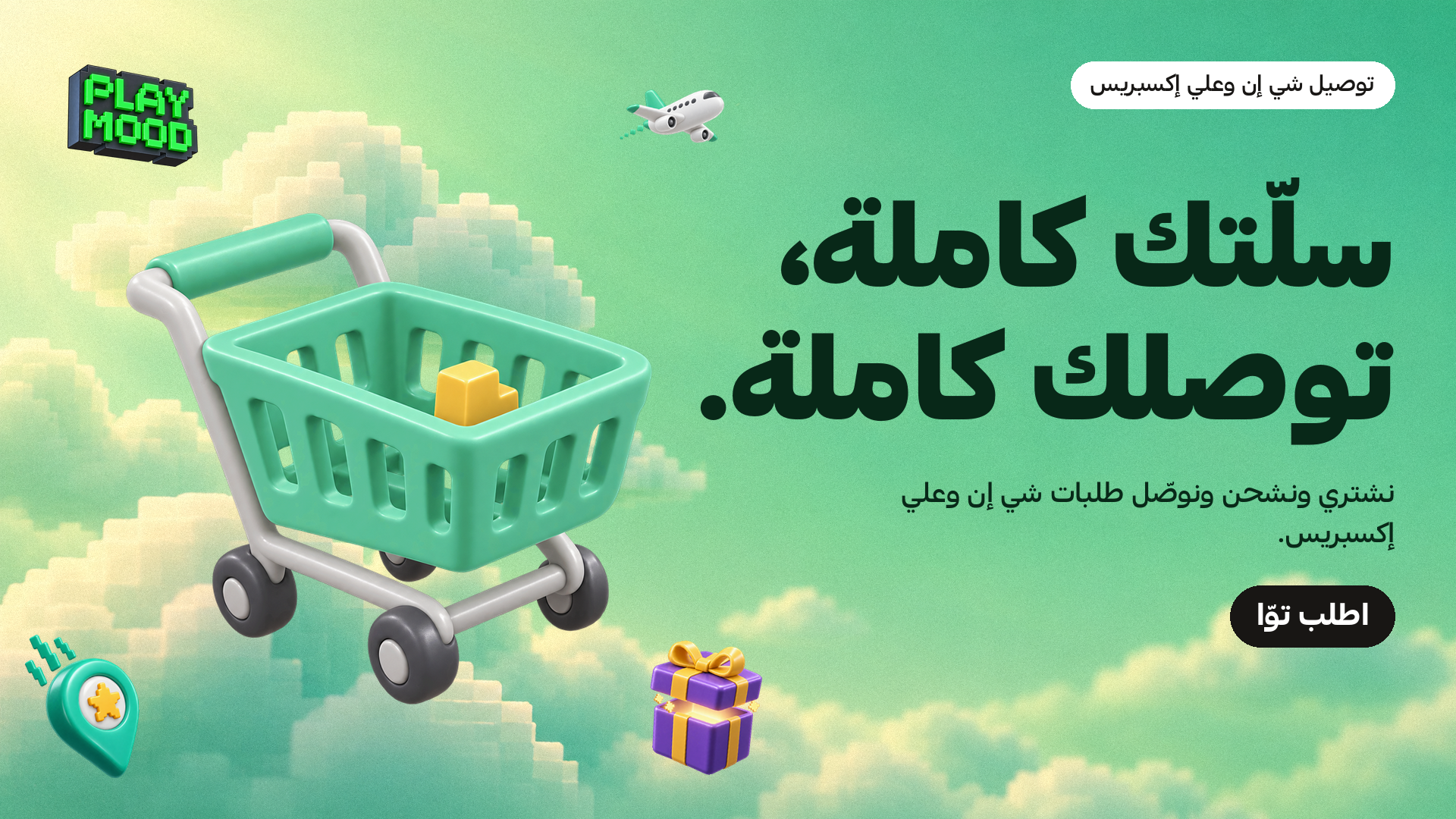
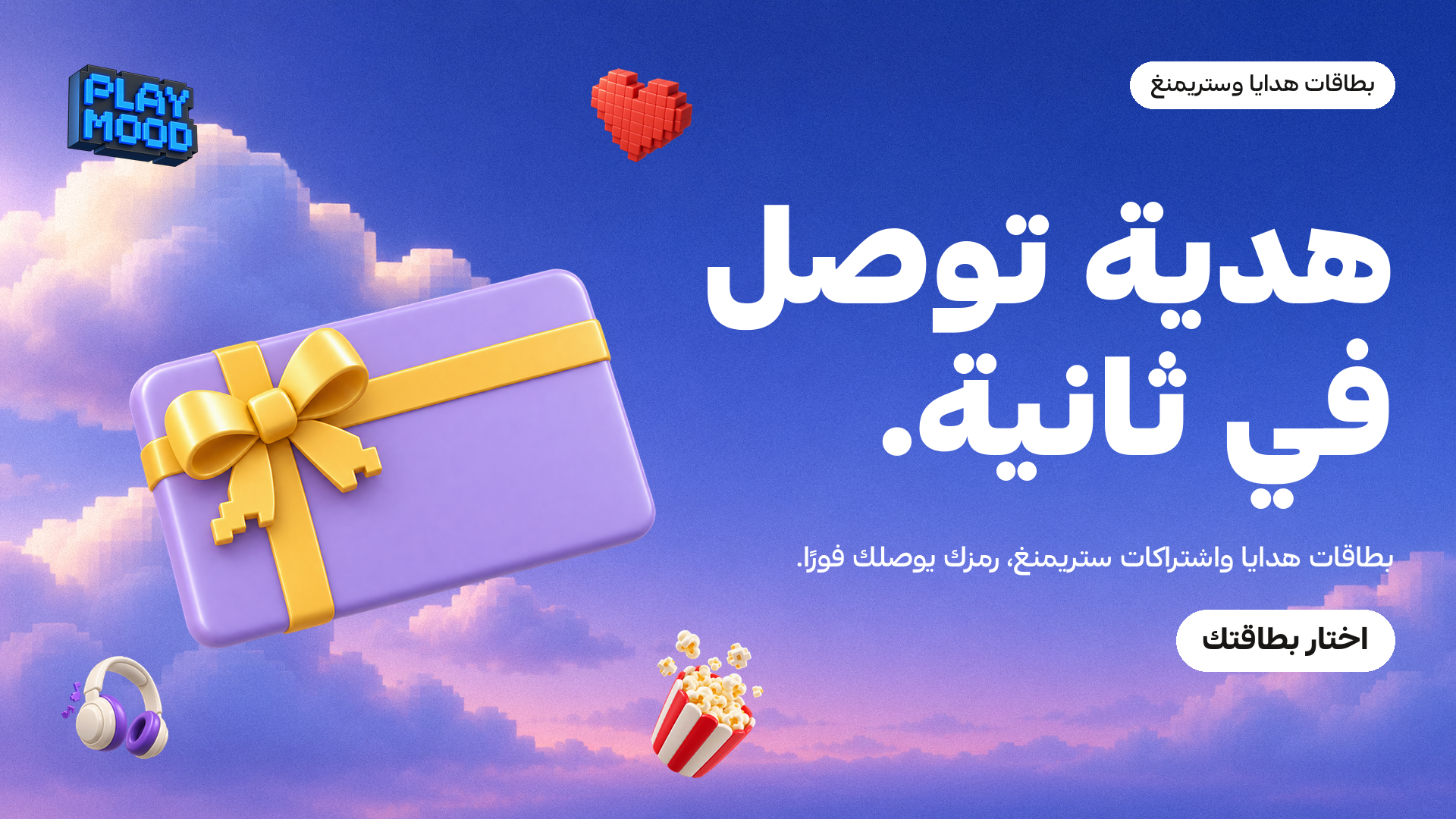
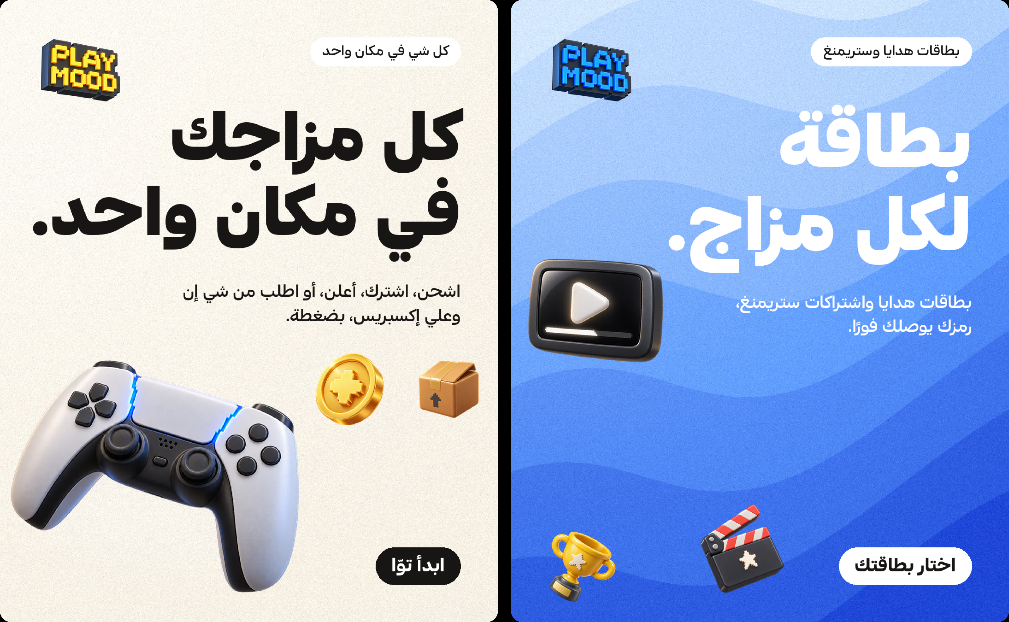
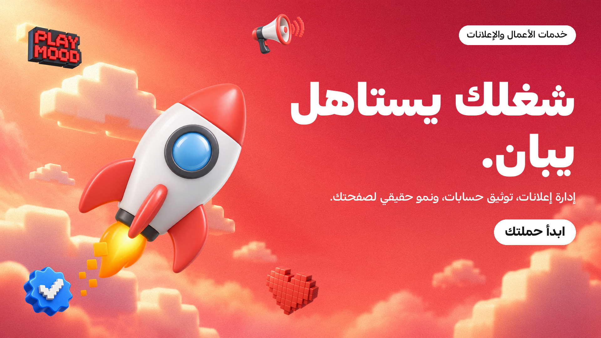
Key visuals. Fifty-six layouts across 1:1, 4:5, 9:16 and 16:9, in three sets: the core line per genre, alternate copy and heroes, and the “Worlds” set on voxel skies.
What was delivered
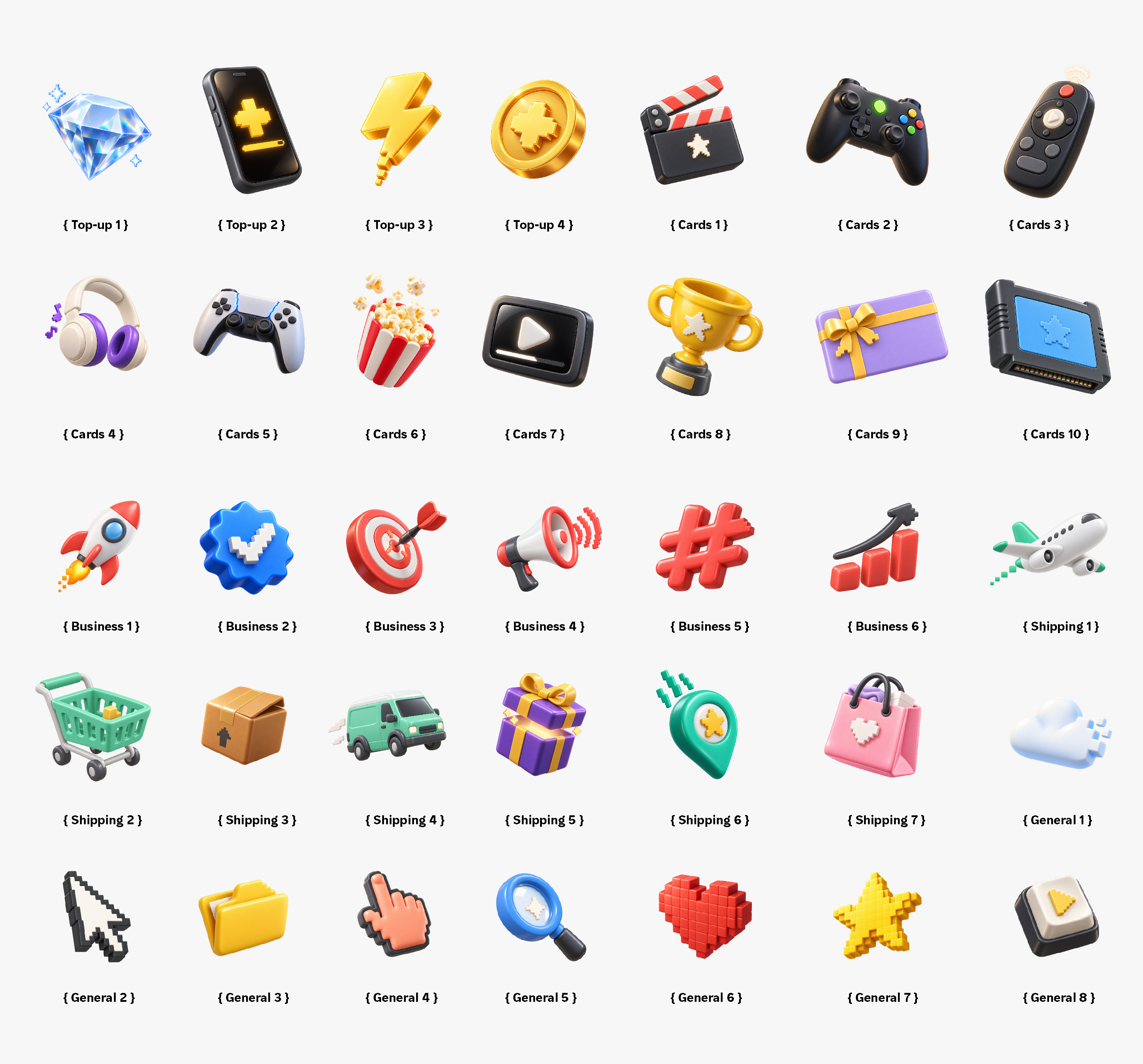
Brand strategy and the four-genre architecture. A tone of voice and an Arabic copy system with a tagline and lines for every genre. The logo in four colourways with transparent and on-colour versions. A 3D object library across five groups, a background library of gradient washes and Worlds skies, fifty-six key visuals in four ratios, and twenty-eight motion compositions with web-ready exports.