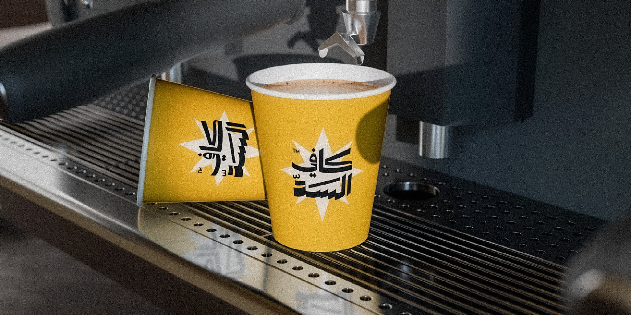
Coffe Alsad has always been more than a coffee stop — people sit, read, study, play, and meet there for hours. This rebrand carries that familiarity into a more current identity, one that speaks to a younger crowd without asking the regulars to feel like guests in their own place.
Familiar doesn’t have to mean dated.
Coffe Alsad already had something most brands spend years trying to build: recognition. The job here was to sharpen that recognition, not start over — to find the version of the brand that still feels like itself but reads as current to a younger generation too.
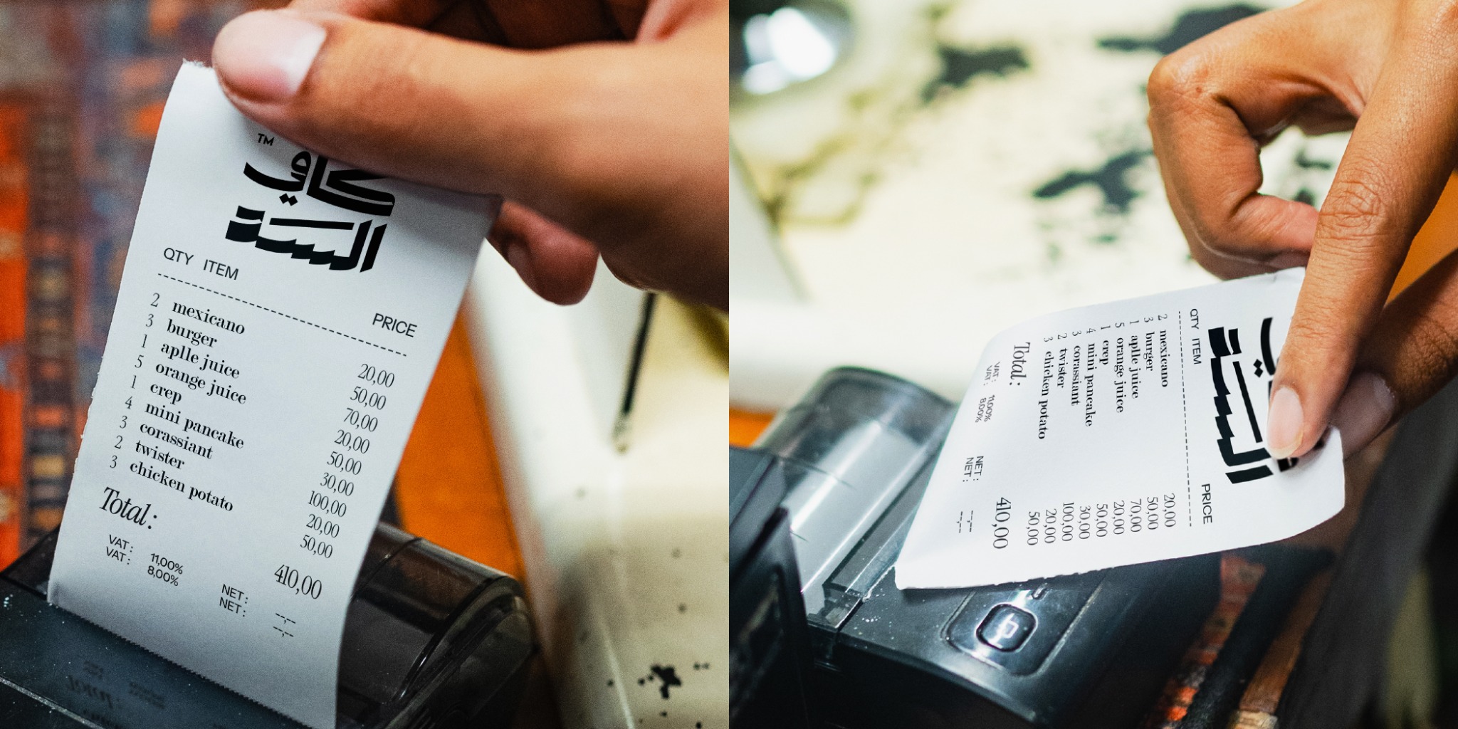
The renewal lives in the details, not the name.
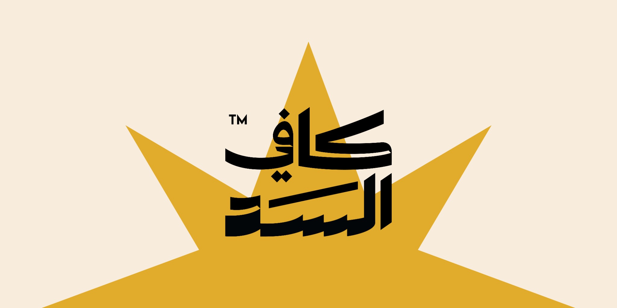
Nothing about the strategy asks longtime customers to relearn the brand. The wordmark stays direct, Arabic, and easy to read at a glance — the language a regular already knows. Freshness comes from elsewhere: tighter proportions, a more deliberate palette, and compositions that feel current without chasing a trend.
An Arabic wordmark built to carry the whole brand alone.
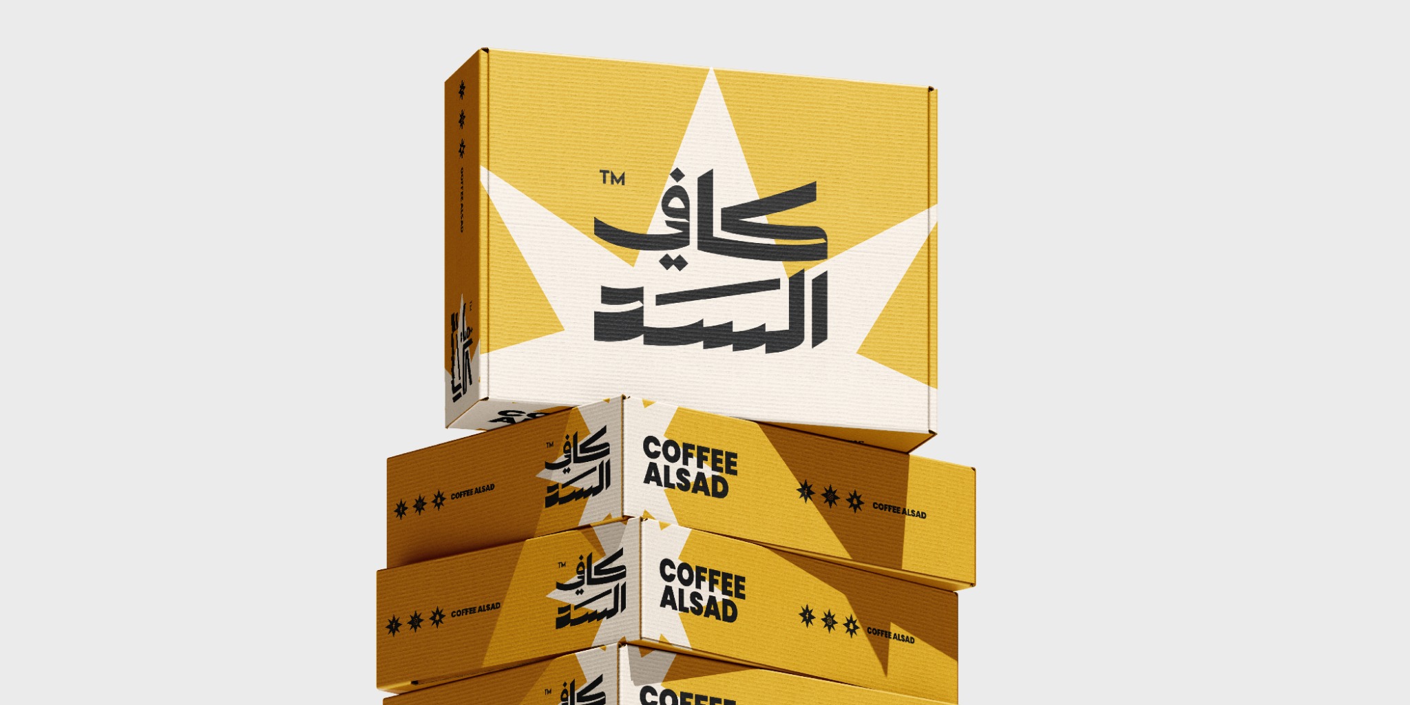
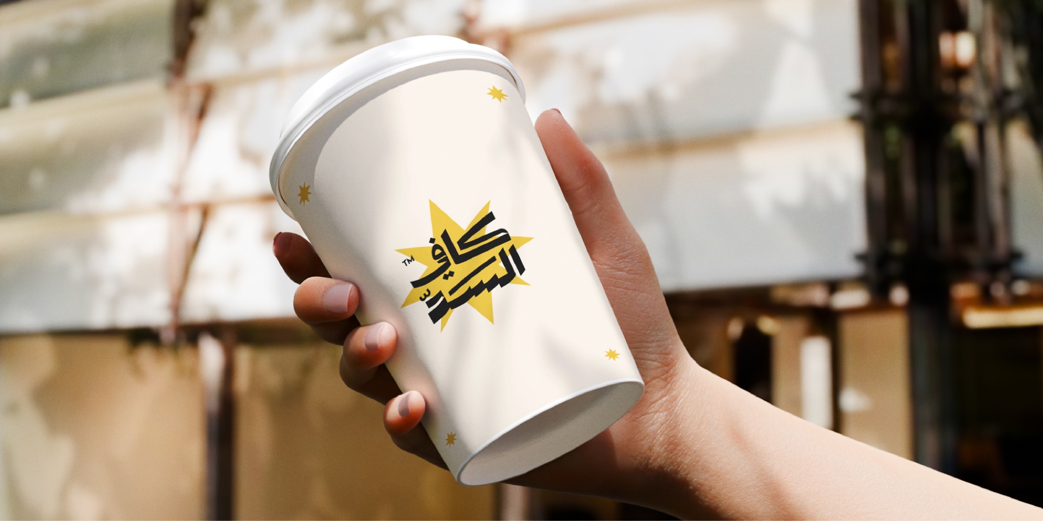
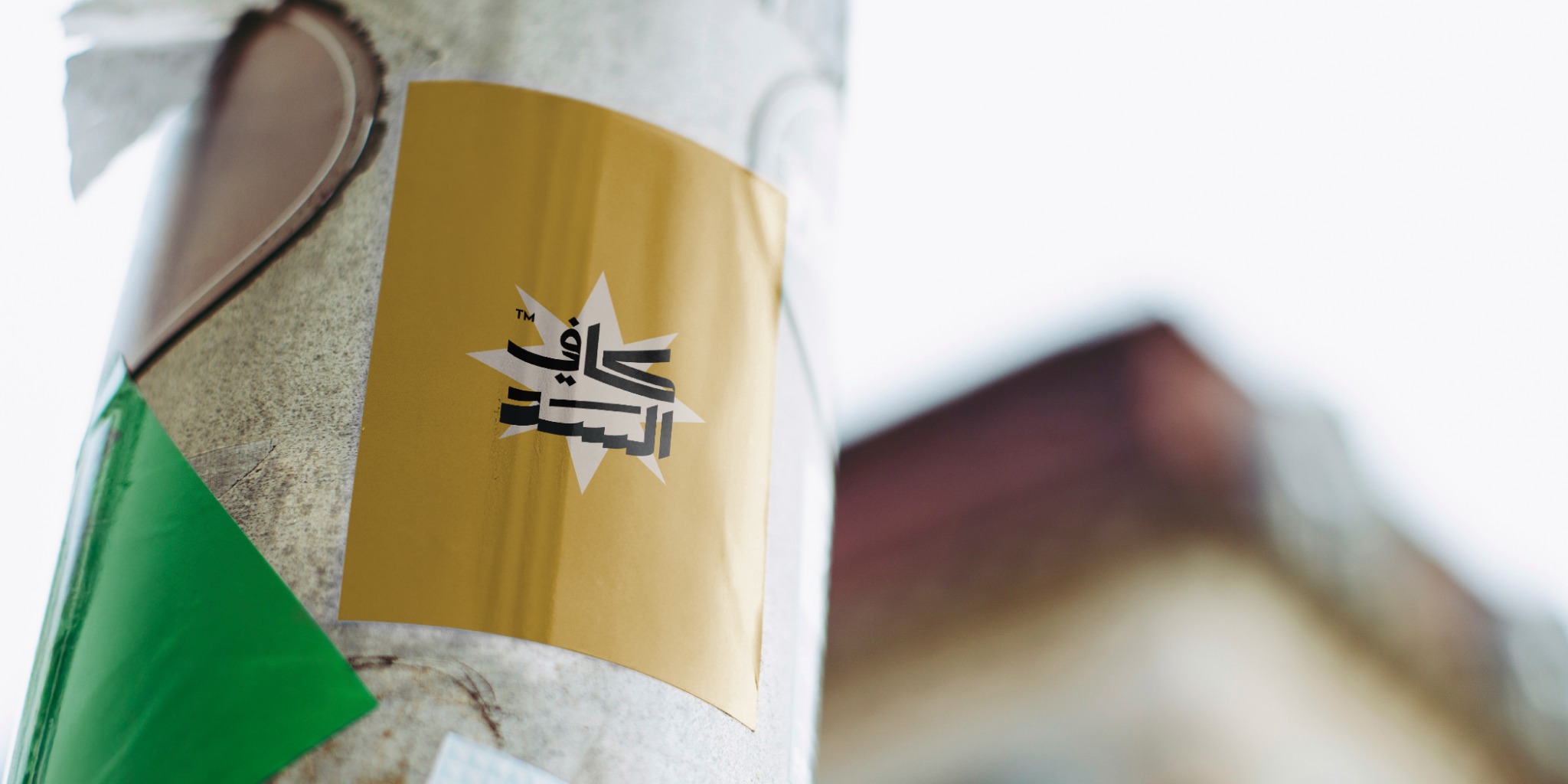
There’s no English counterpart pulling focus — the Arabic wordmark stands on its own. Its letterforms stay legible and grounded, but the strokes run longer and the construction sits tighter, giving the mark a rhythm that reads as more current. A single starburst carries the rest: a simple, recognizable cue that scales from a cup sleeve to a storefront without losing its tone.

A system built for however long someone stays.
Some visits are five minutes; others turn into a whole afternoon. The identity had to hold up across both — calm enough not to get in the way, distinctive enough to stay recognizable on a cup, a receipt, a bag, or a wall.

Coffe Alsad, still itself, just sharper.
The rebrand doesn’t trade nostalgia for youth, or the other way around — it gives Coffe Alsad a clearer, more contemporary presence while keeping the ease that made people feel at home there in the first place. More people can see themselves in it now, without the ones who already loved it feeling pushed out.