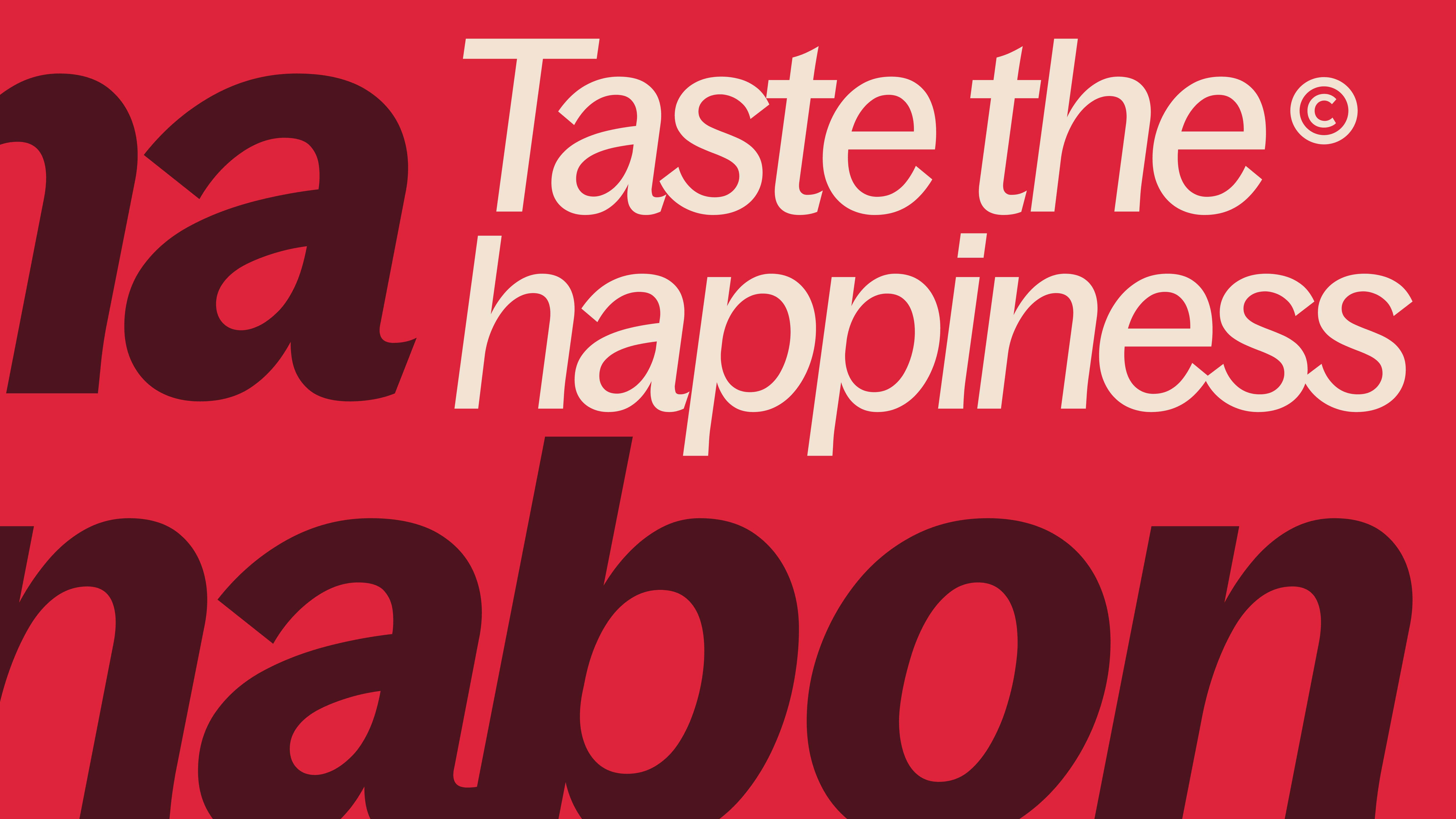
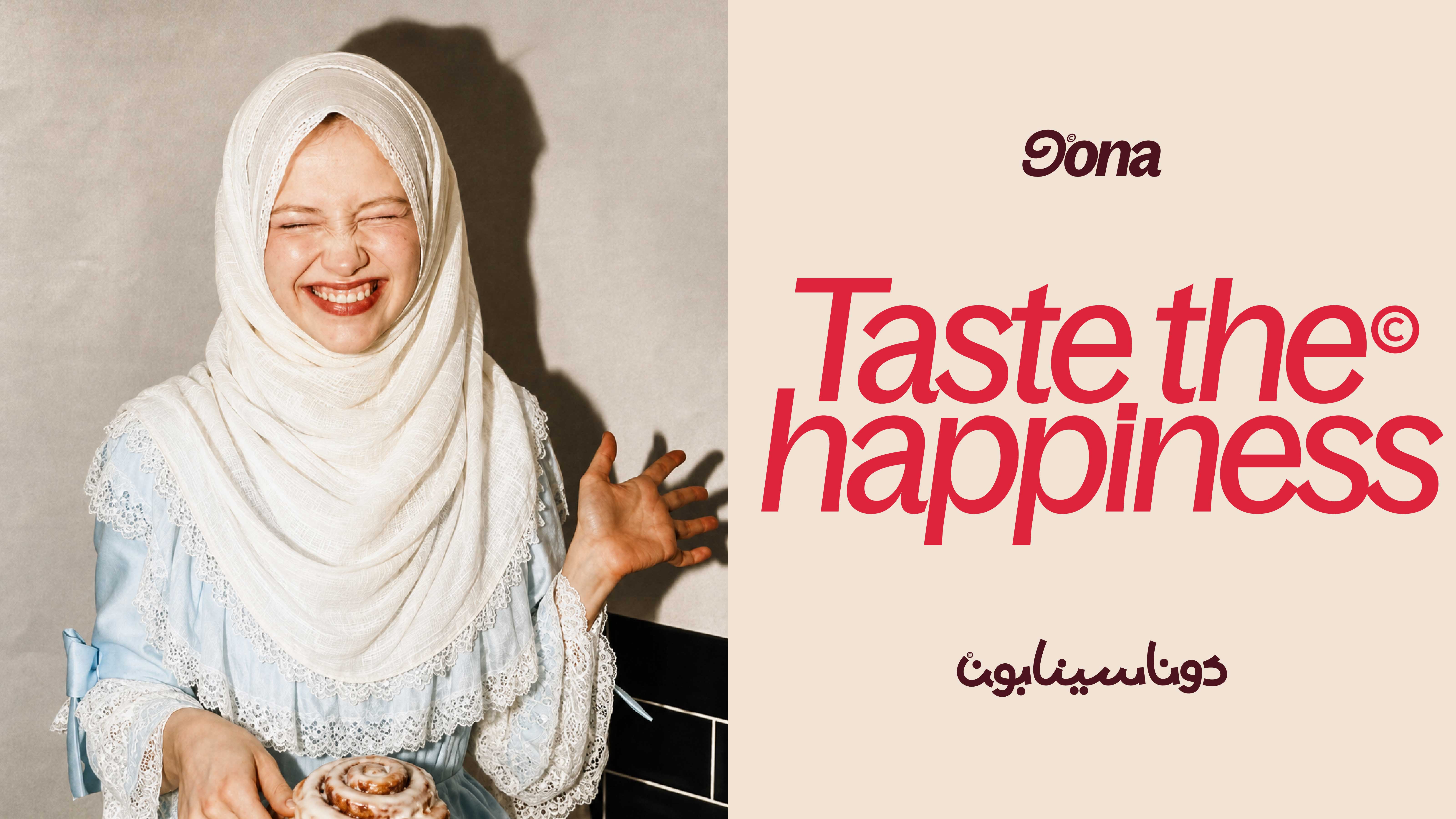
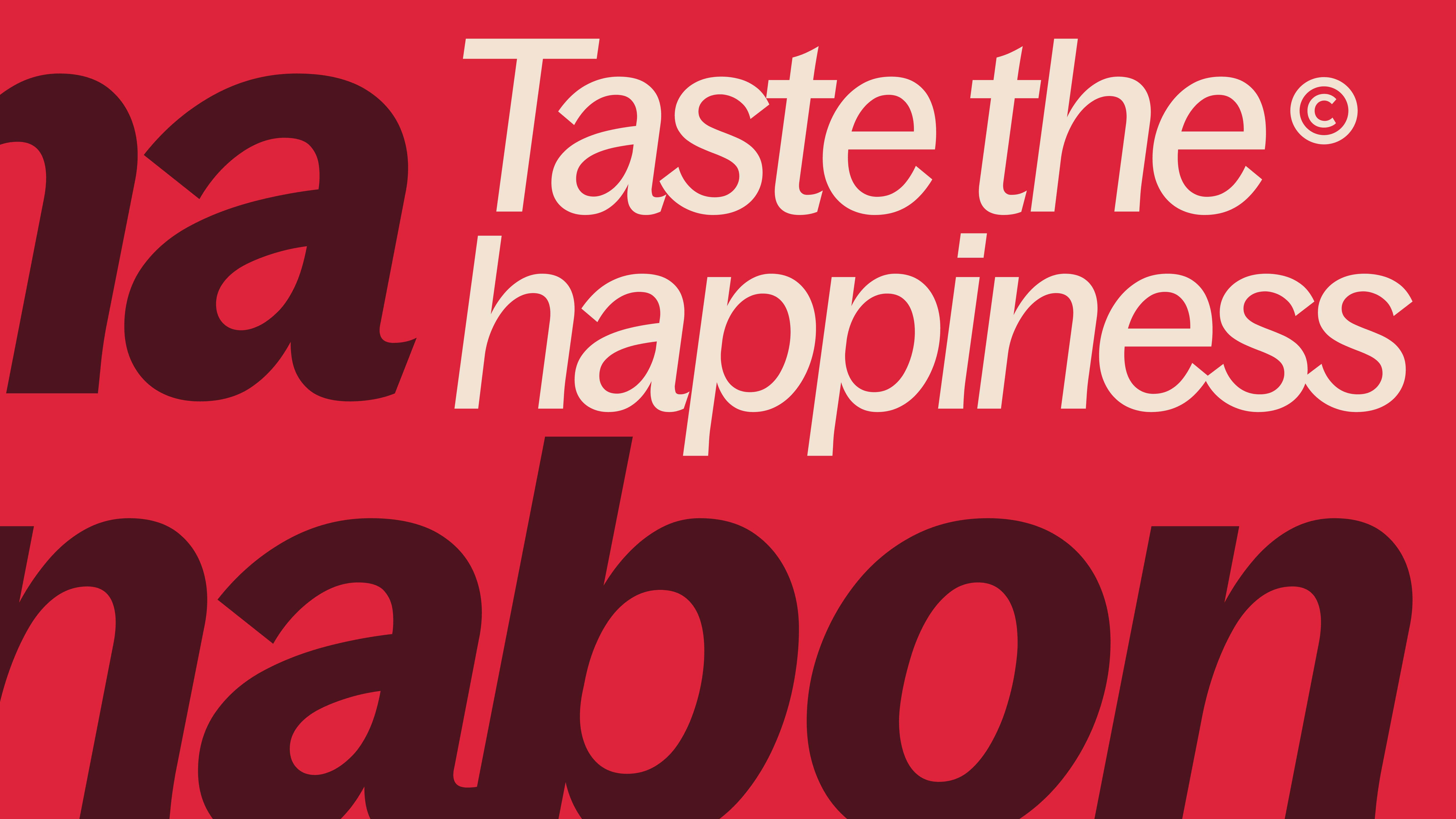
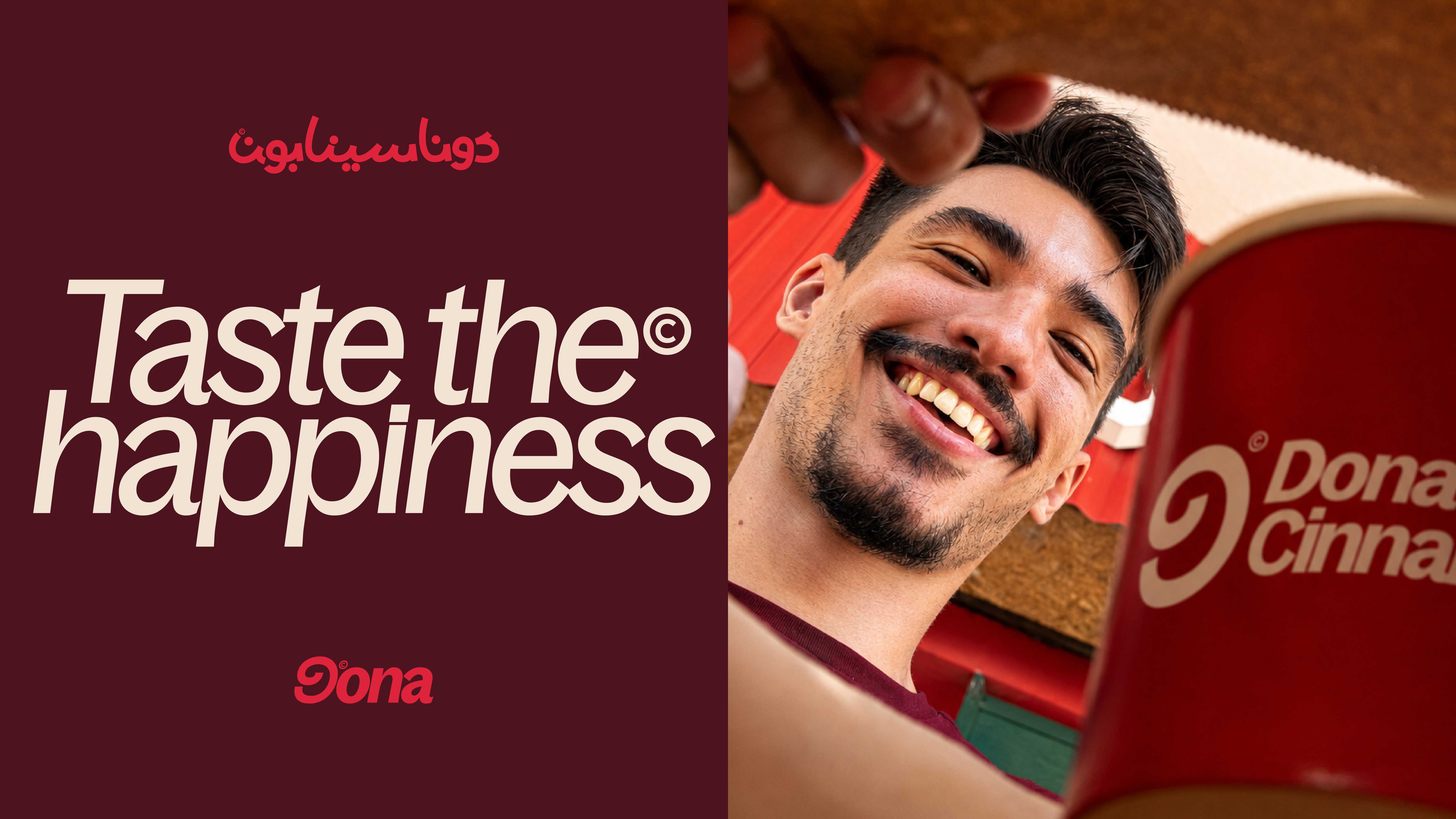
Dona Cinnabon starts from a simple idea: the roll isn’t just something you eat, it’s a small reward. The identity takes the cinnamon roll’s spiral and turns it into a brand symbol, pairs it with typography that has some attitude, and builds a warm world around appetite, closeness, and one line — “Taste the happiness”.
The feeling had to be as recognizable as the roll.
This isn’t a brand built purely on bakery convention. The cinnamon roll is still the trigger, but happiness is the promise — and that promise is what lets the identity move between appetite, expression, and real human reaction without ever feeling scattered.
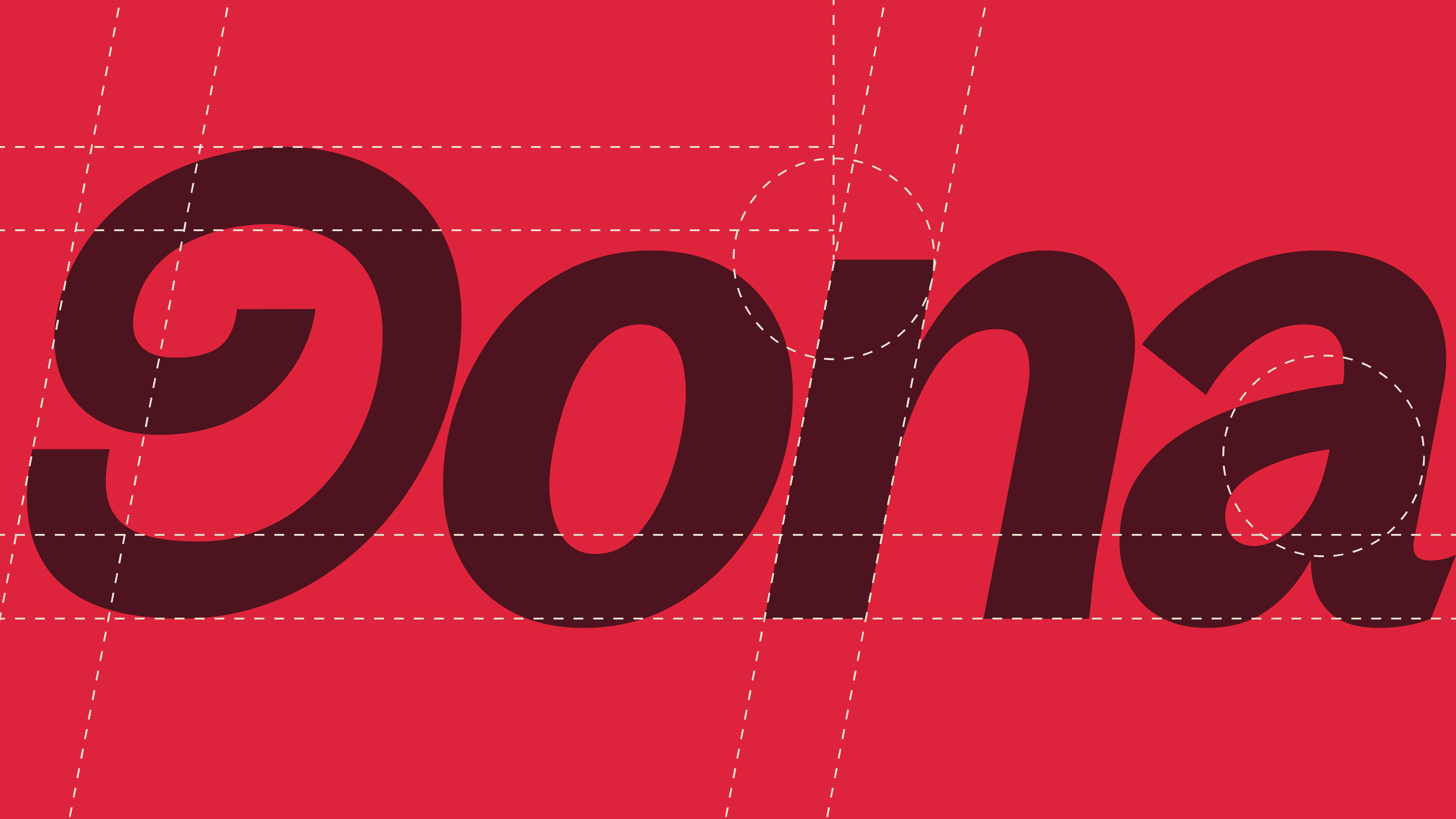
One spiral, doing double duty.
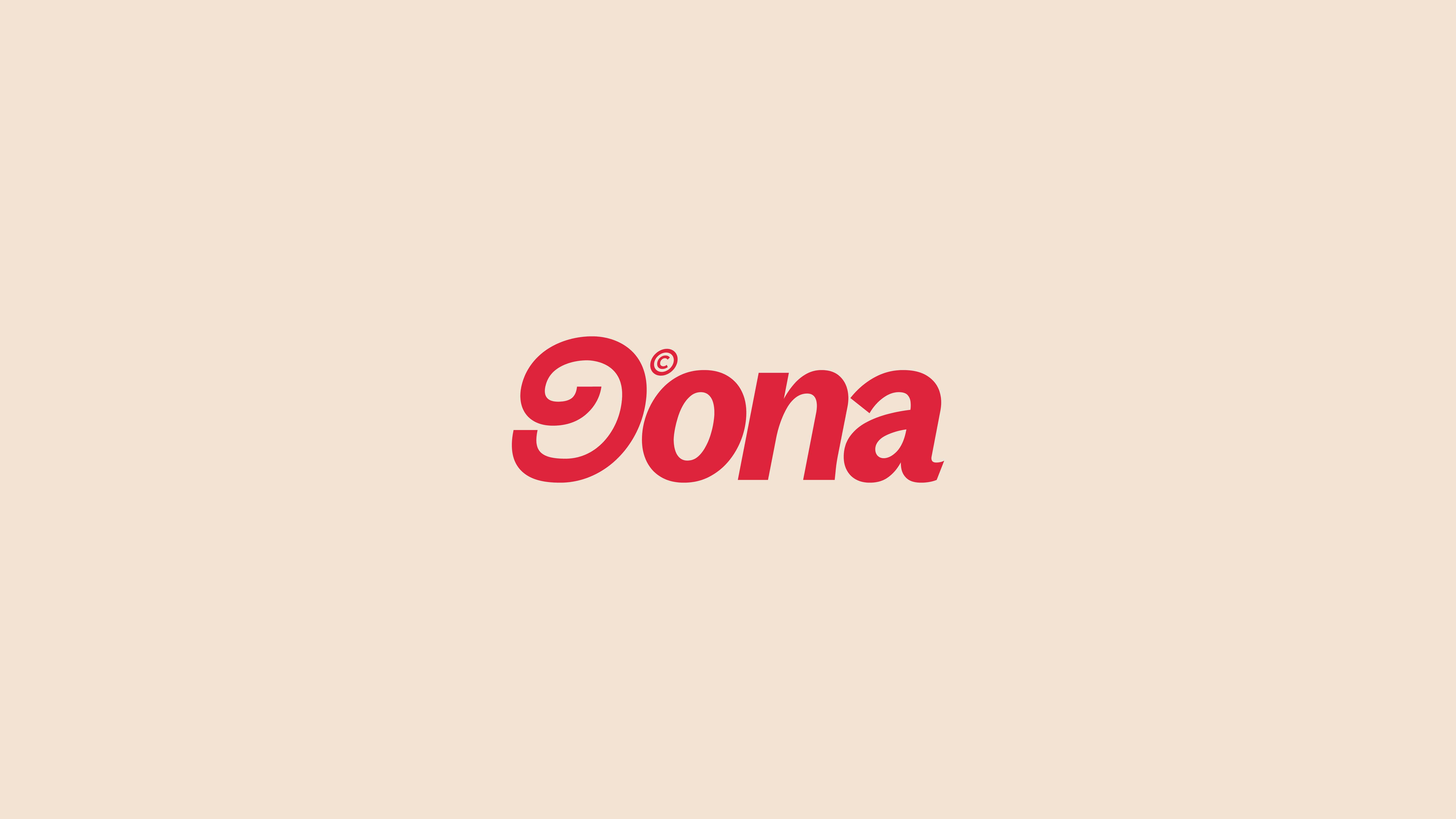
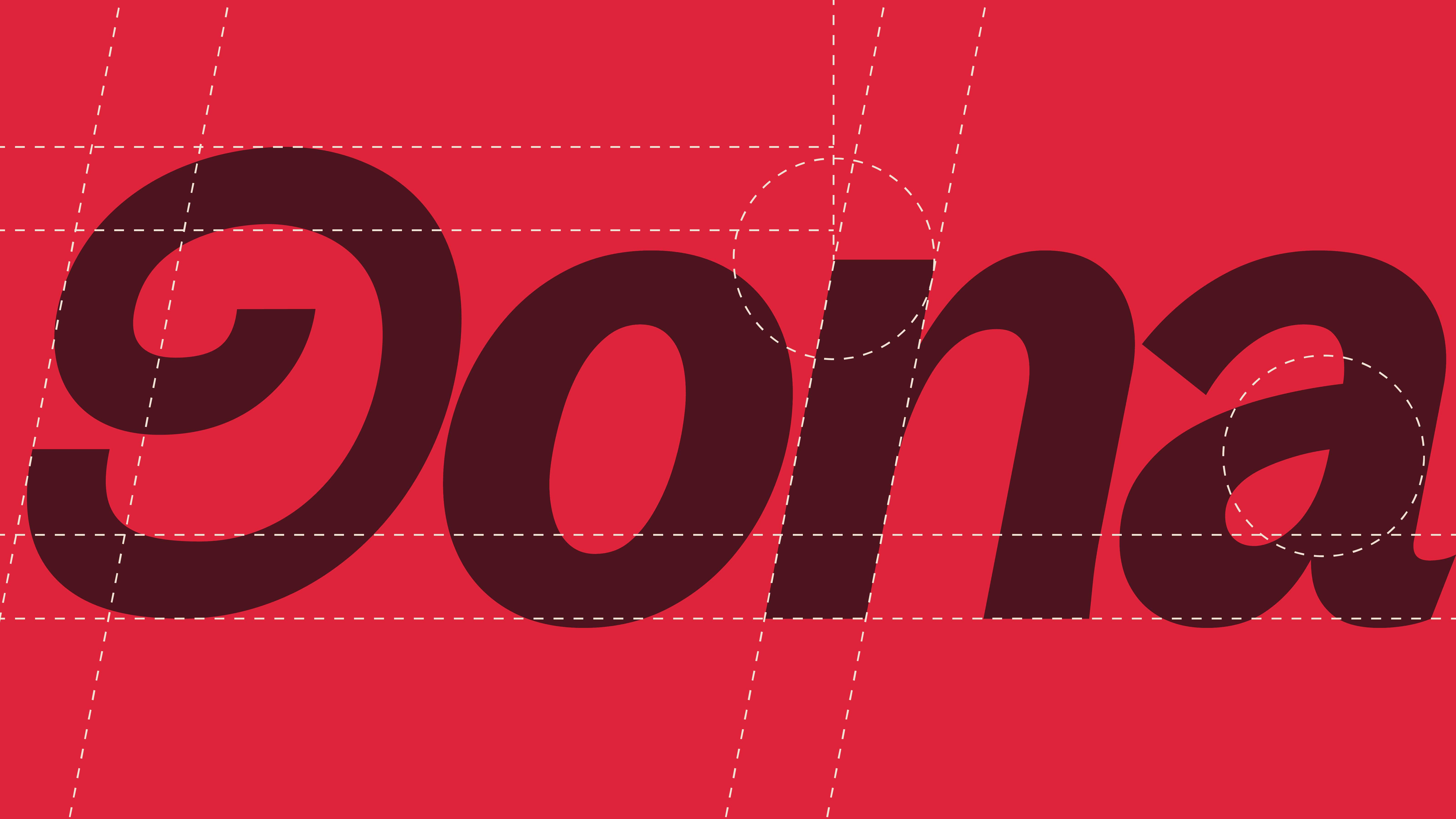
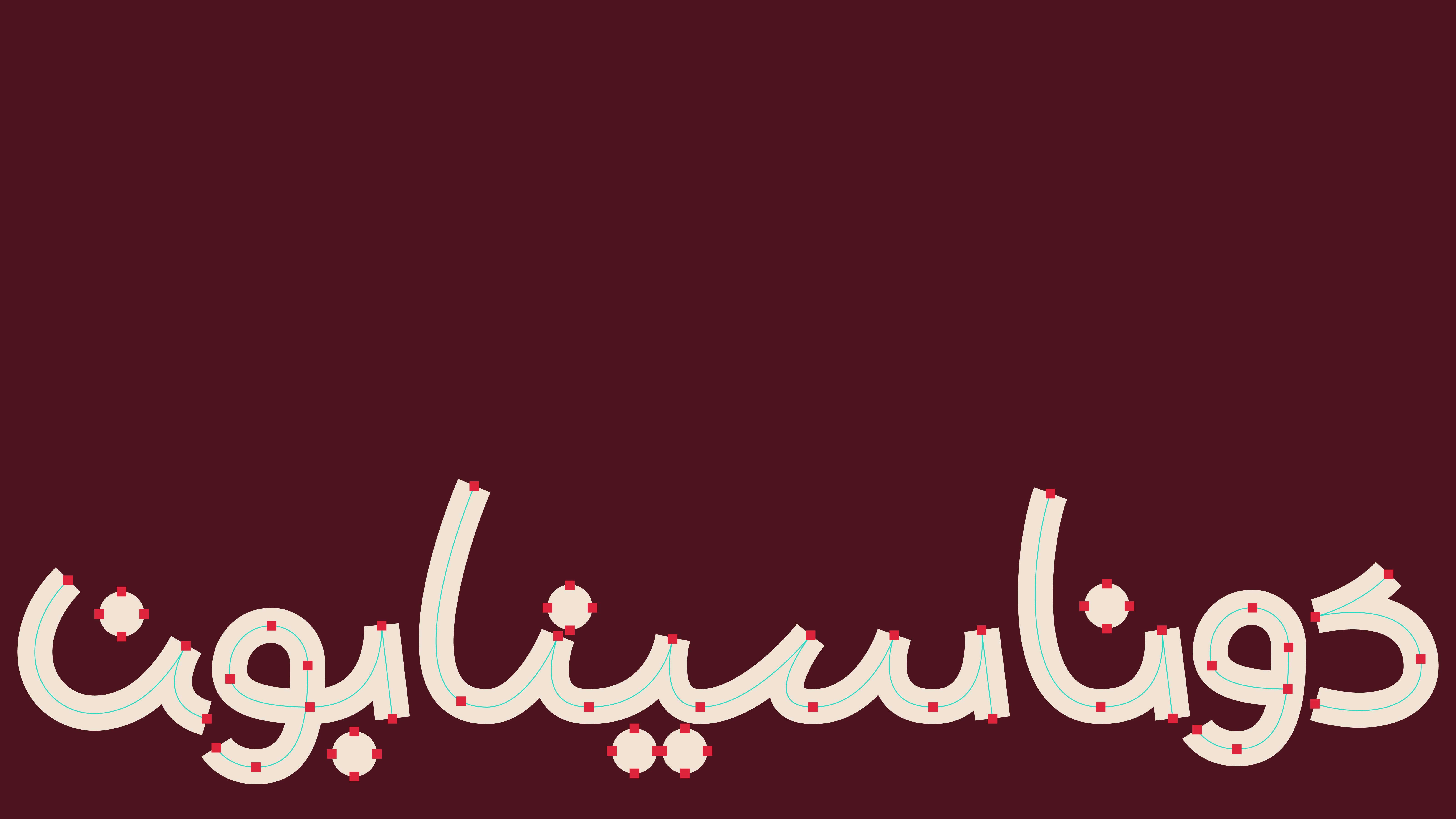
The spiral is the most recognizable thing about a cinnamon roll, so that’s what became the mark — reduced down until it works alone or sits next to the wordmark. “Taste the happiness” stays close to the name in the lockup, which makes the promise part of the identity itself rather than a line tacked on for campaigns.
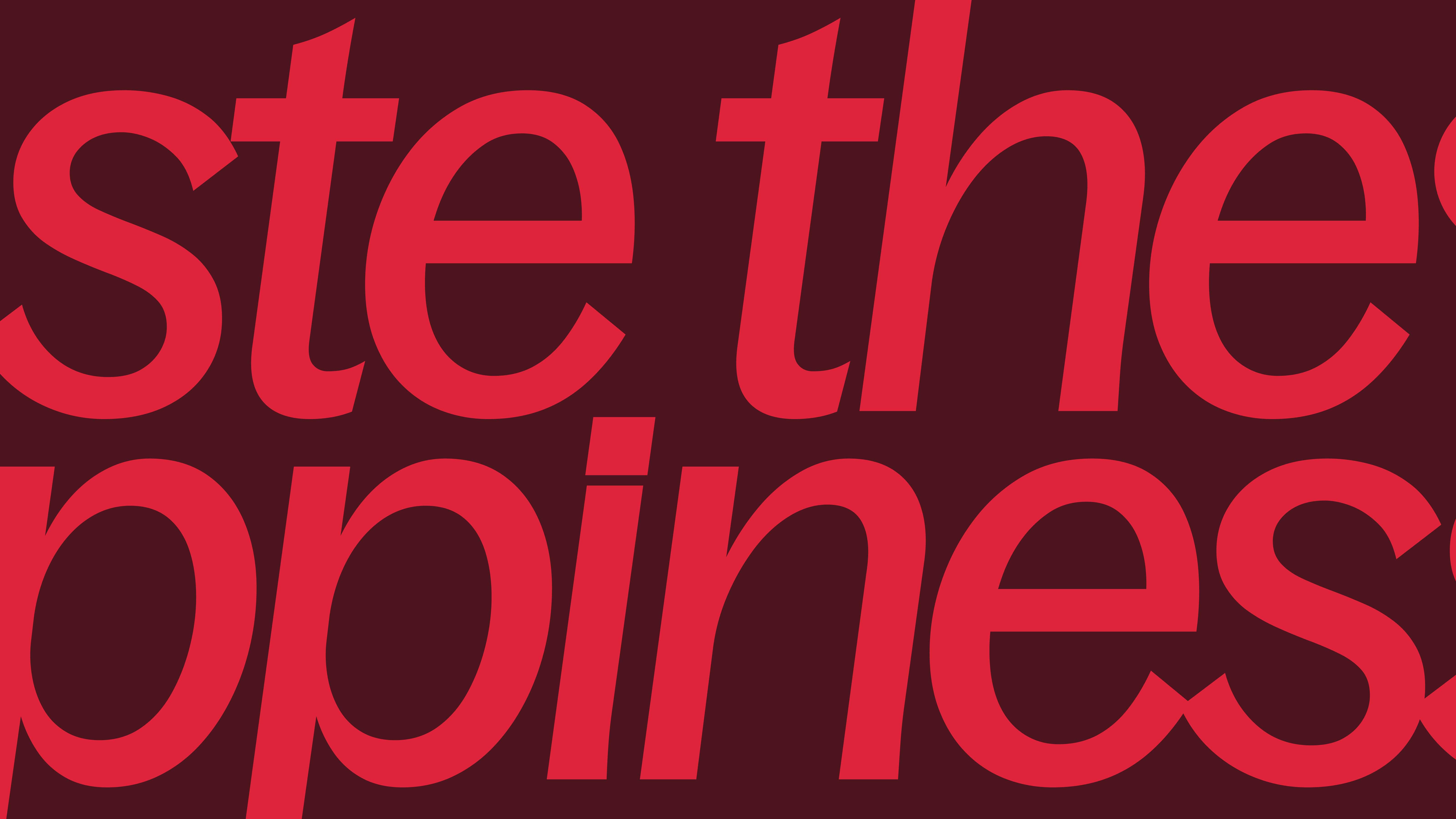
Warmth, turned up a notch.
Cream, deep burgundy, vivid red — the palette still says baked and rich, but it skips anything that reads as rustic or expected. Typography runs oversized to give the system some energy, and the cream space left around it gives the product and the spiral room to feel premium rather than crowded.
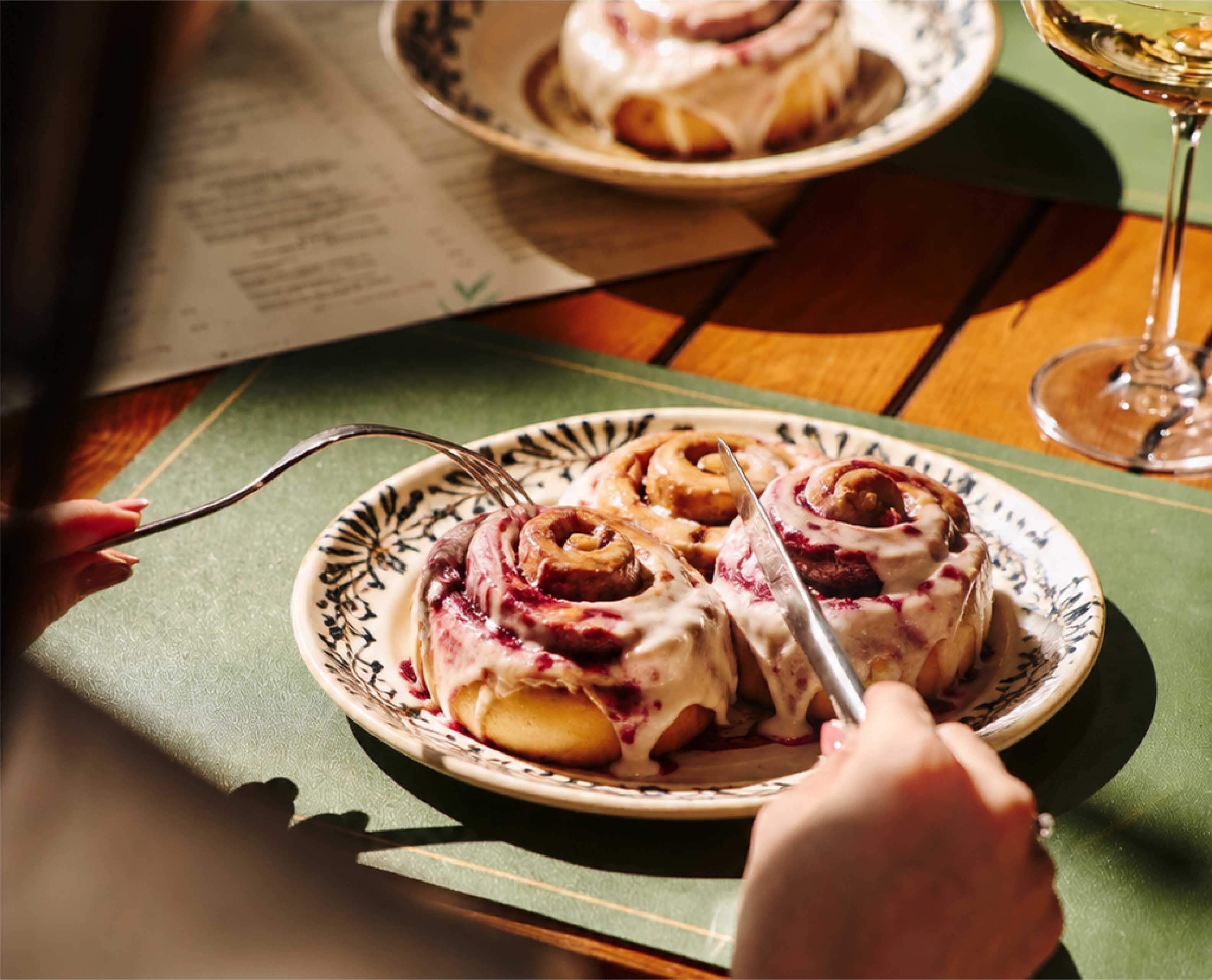
The reaction matters as much as the roll.
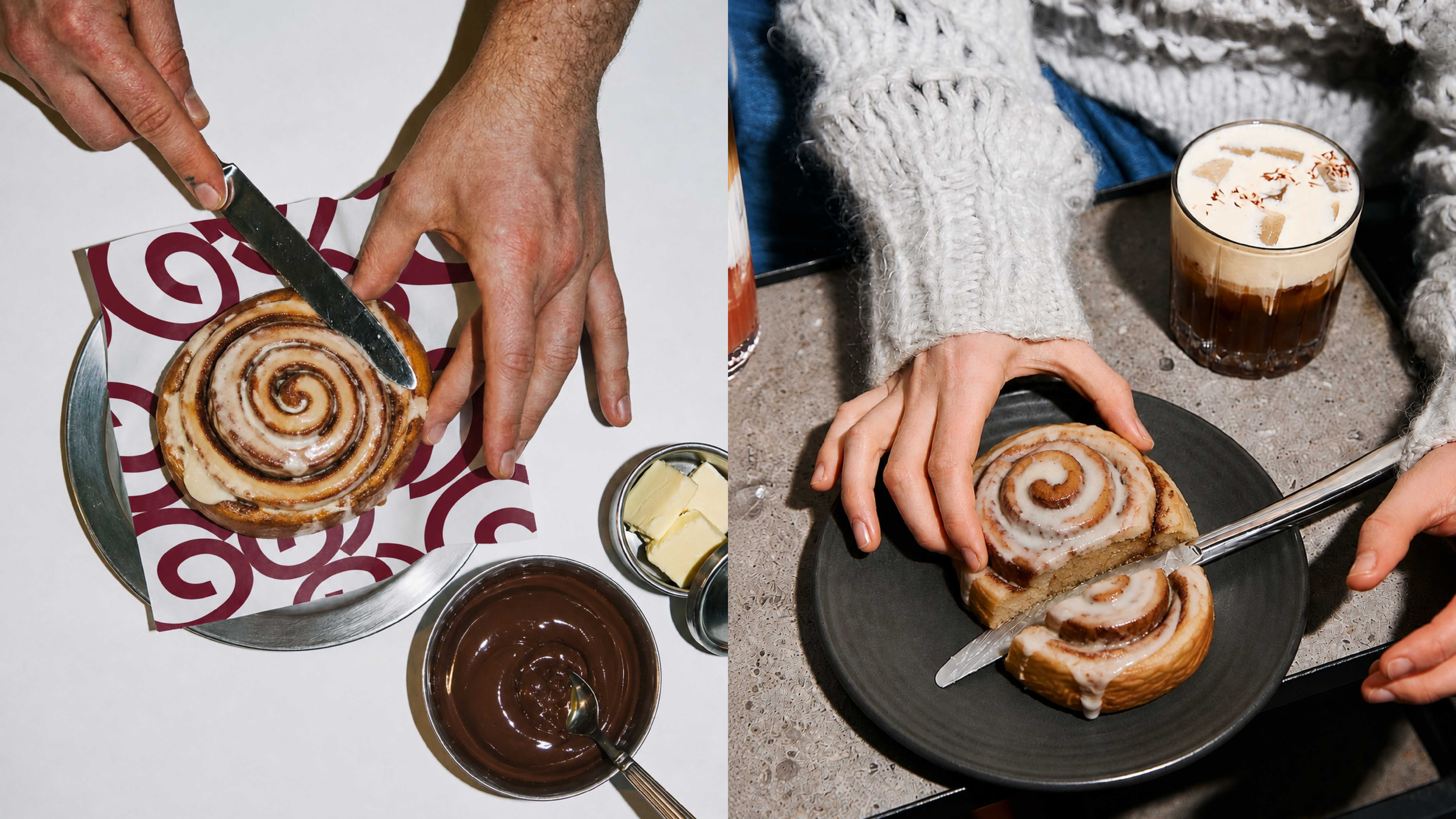
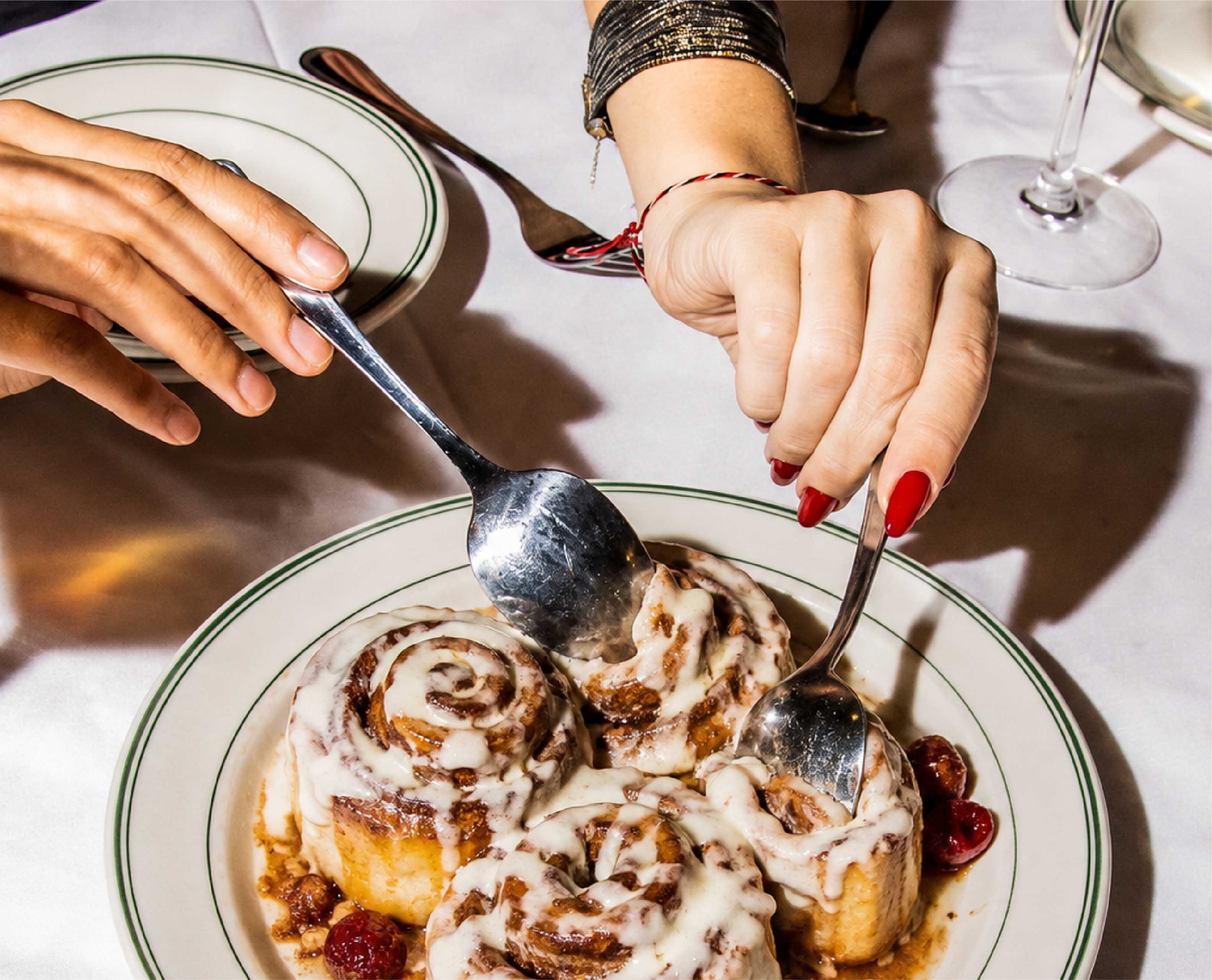
The photography stays close and a little messy on purpose — bites, hands, icing, real expressions. The product is still the center of every frame, but it’s the human reaction that sells the promise, turning “Taste the happiness” into something you can see instead of just read.
Application
Same system, whether it’s quiet or loud.
Clean, logo-led layouts and image-heavy campaign spreads run off the same toolkit — cropped type, saturated color fields, close product shots, and the spiral mark, mixed and matched depending on what the moment needs. The tone holds steady even when the format changes.