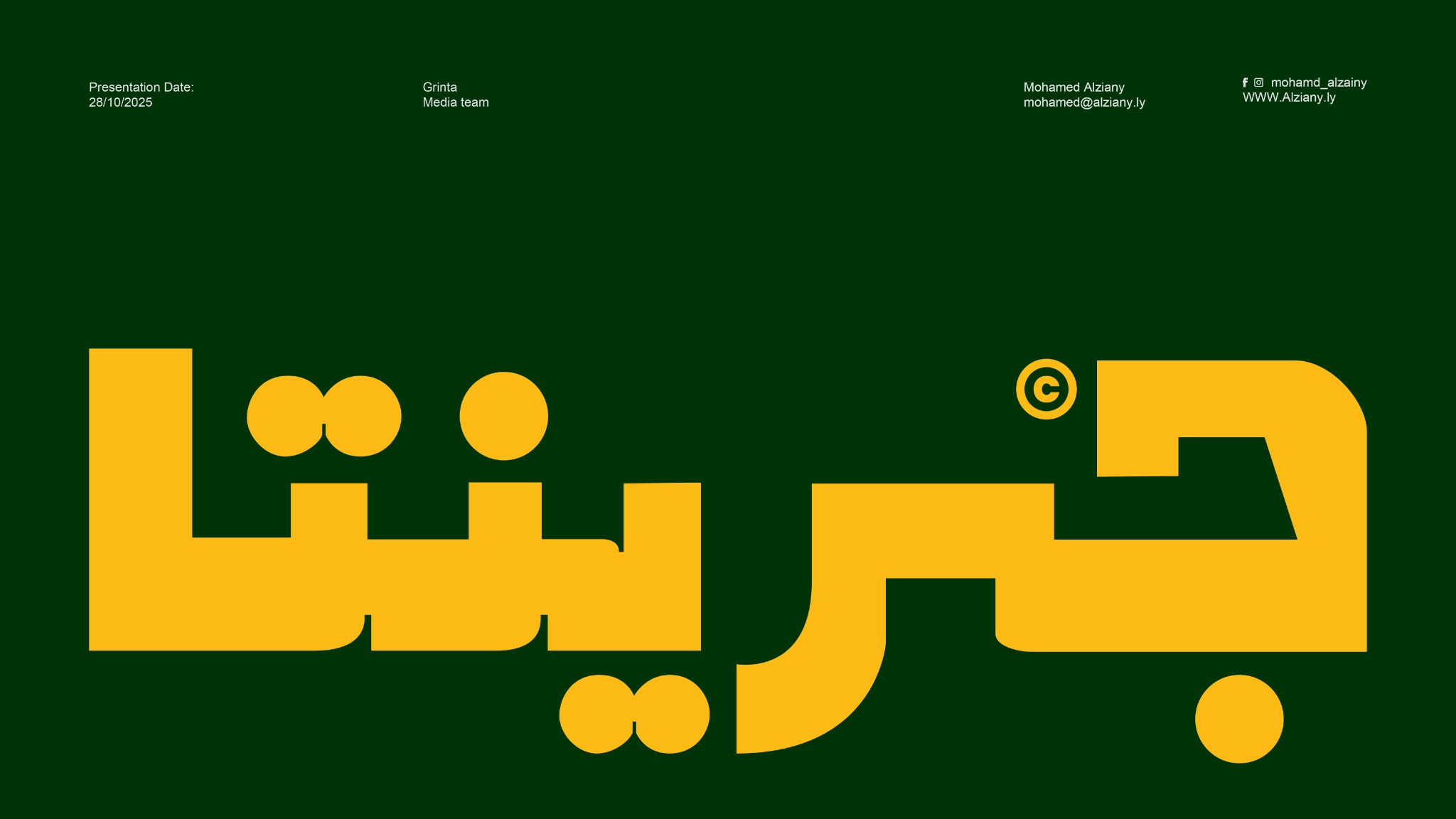
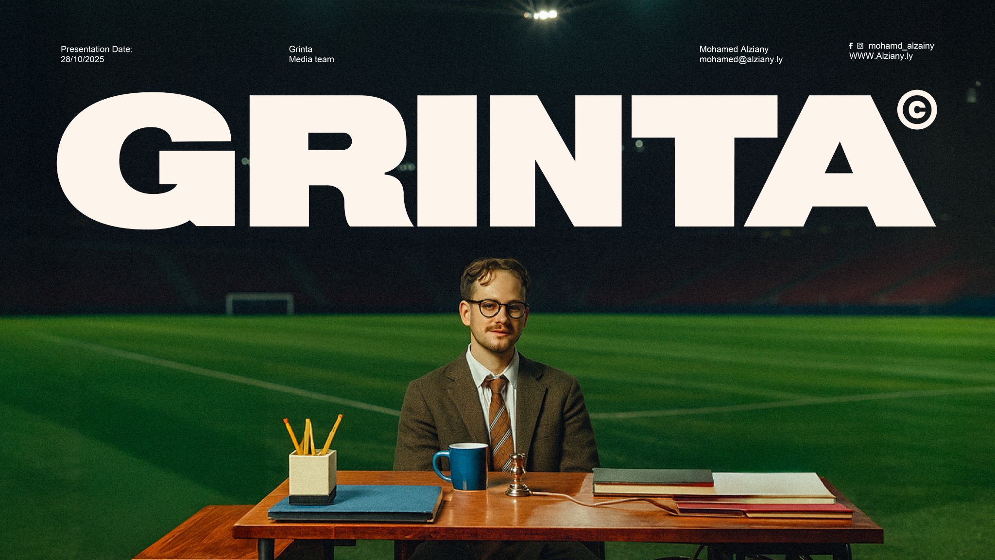
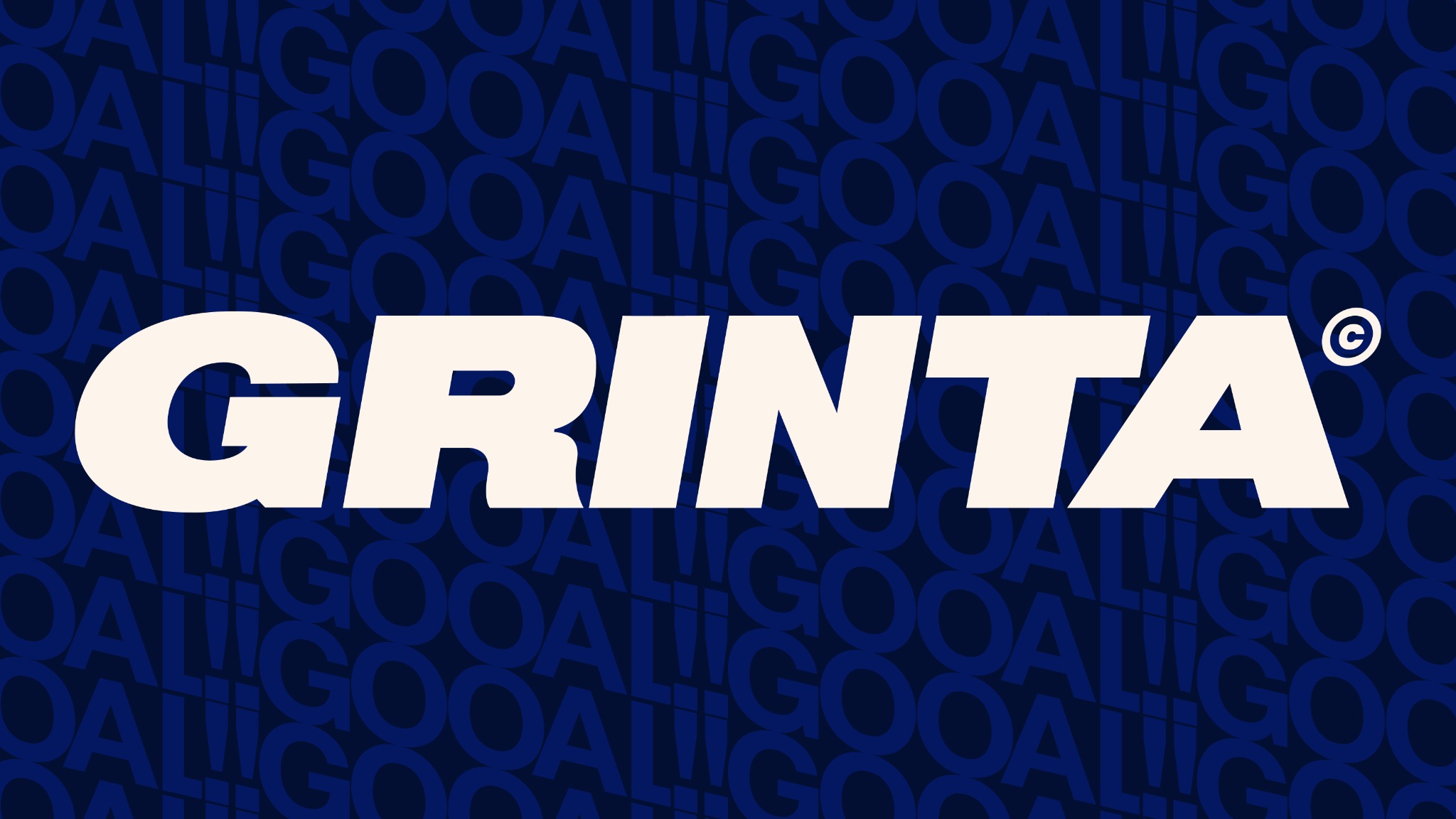
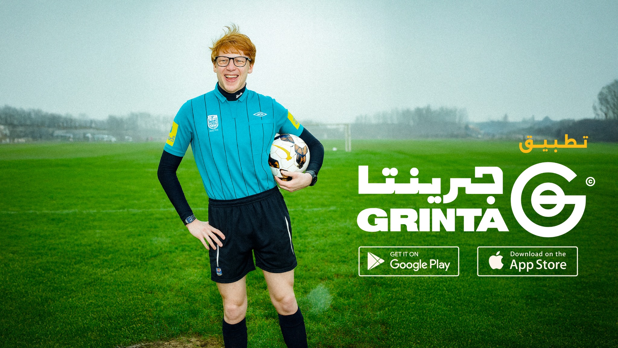
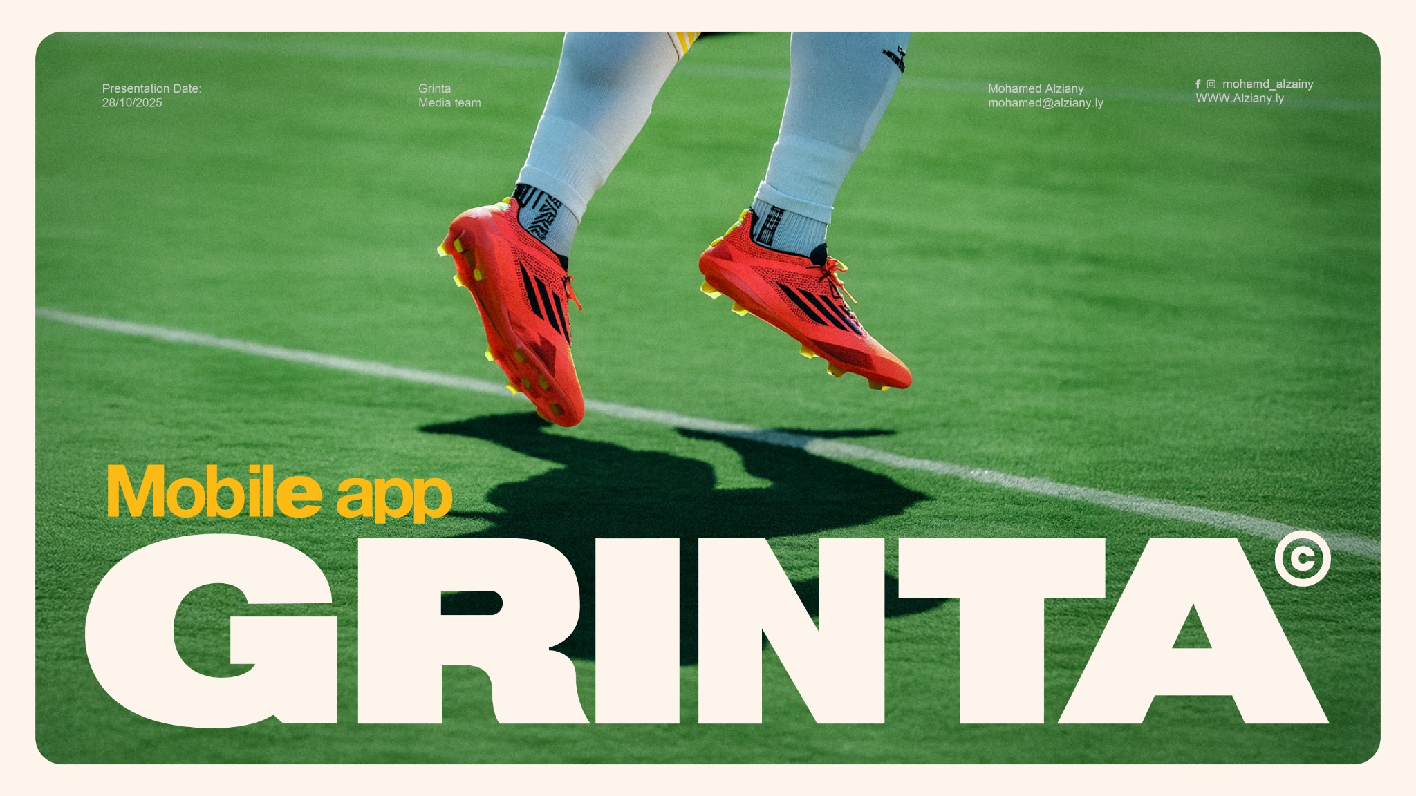
GRINTA is a football app that didn’t want to look like software. The identity leans on bold Arabic and Latin wordmarks, a compact circular G, saturated color, and football photography shot with grit — closer to the culture around the game than to a typical sports-tech interface.
It had to work as an app and hold up outside one.
An app icon needs to be clean enough to sit on a home screen. A football brand needs enough character to survive on a jersey, a poster, a highlight reel. GRINTA is built from a small set of assets sturdy enough to do both — the same voice, whether it’s showing up in the product or in a campaign.

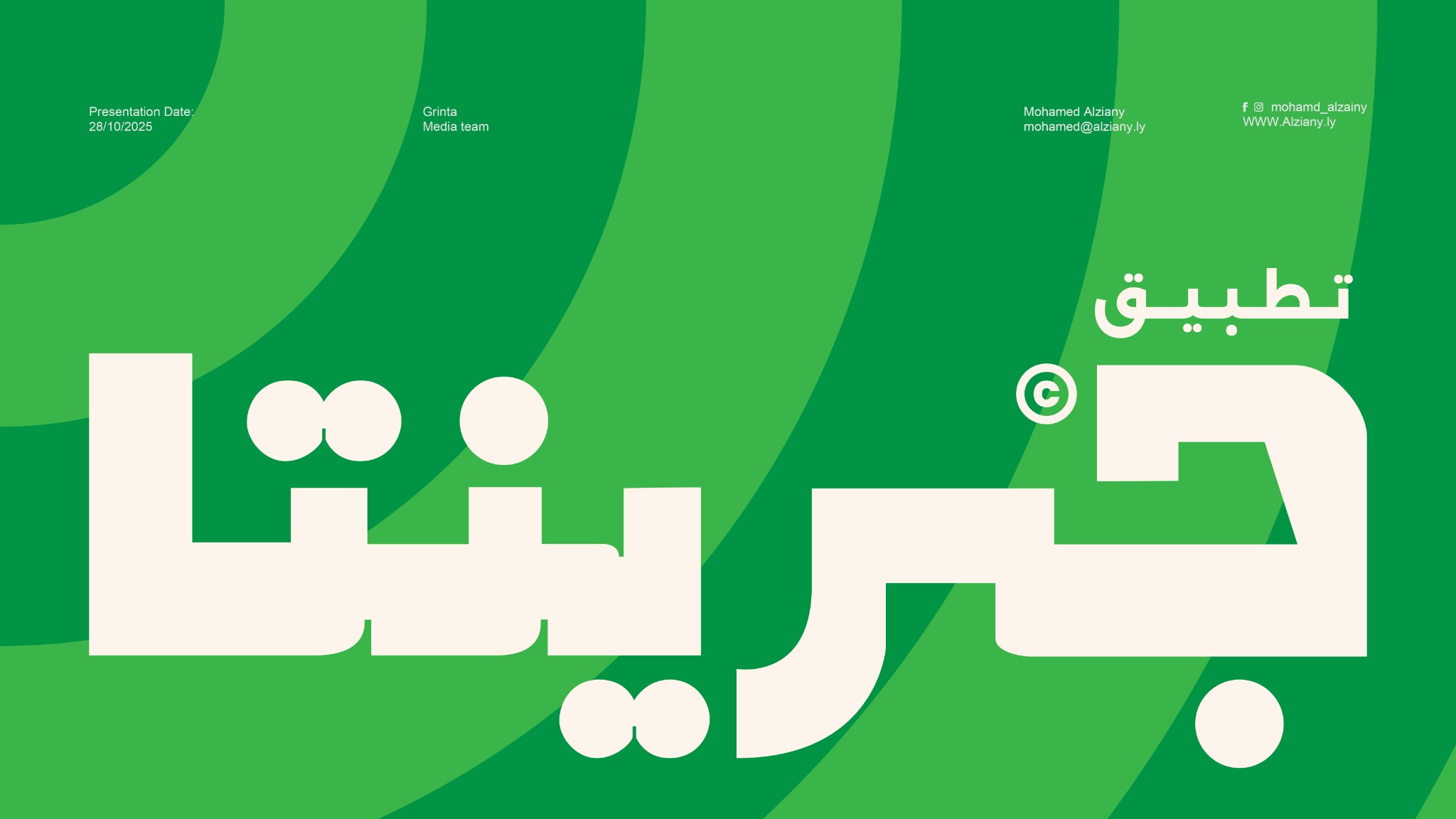
Two scripts, equal weight.
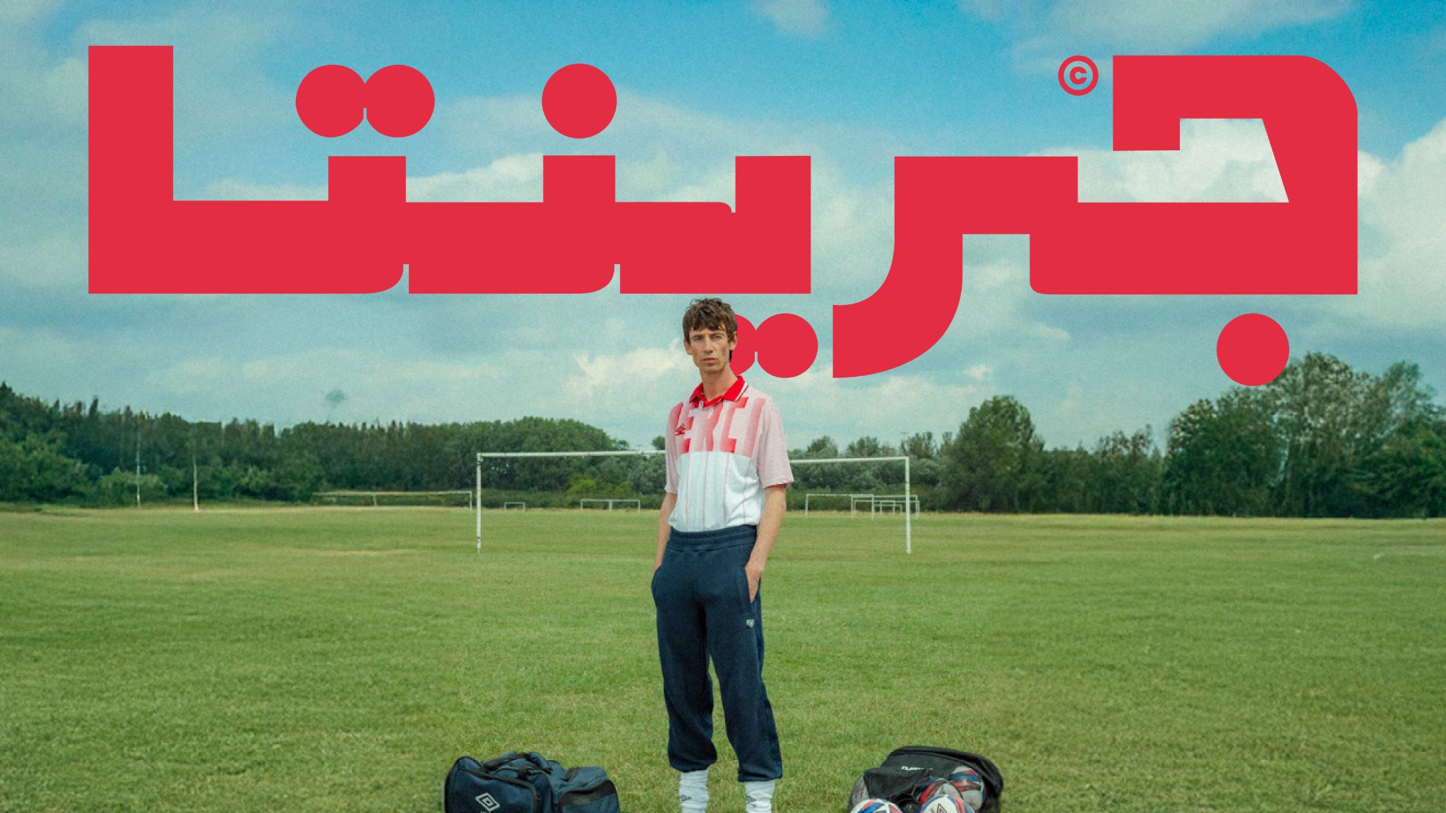
Arabic and Latin carry the same visual weight here — wide, bold, direct, neither one reading as a translation of the other. Both wordmarks lead. The circular G exists for when there’s no room for either: a compressed mark built for app icons and small brand moments.

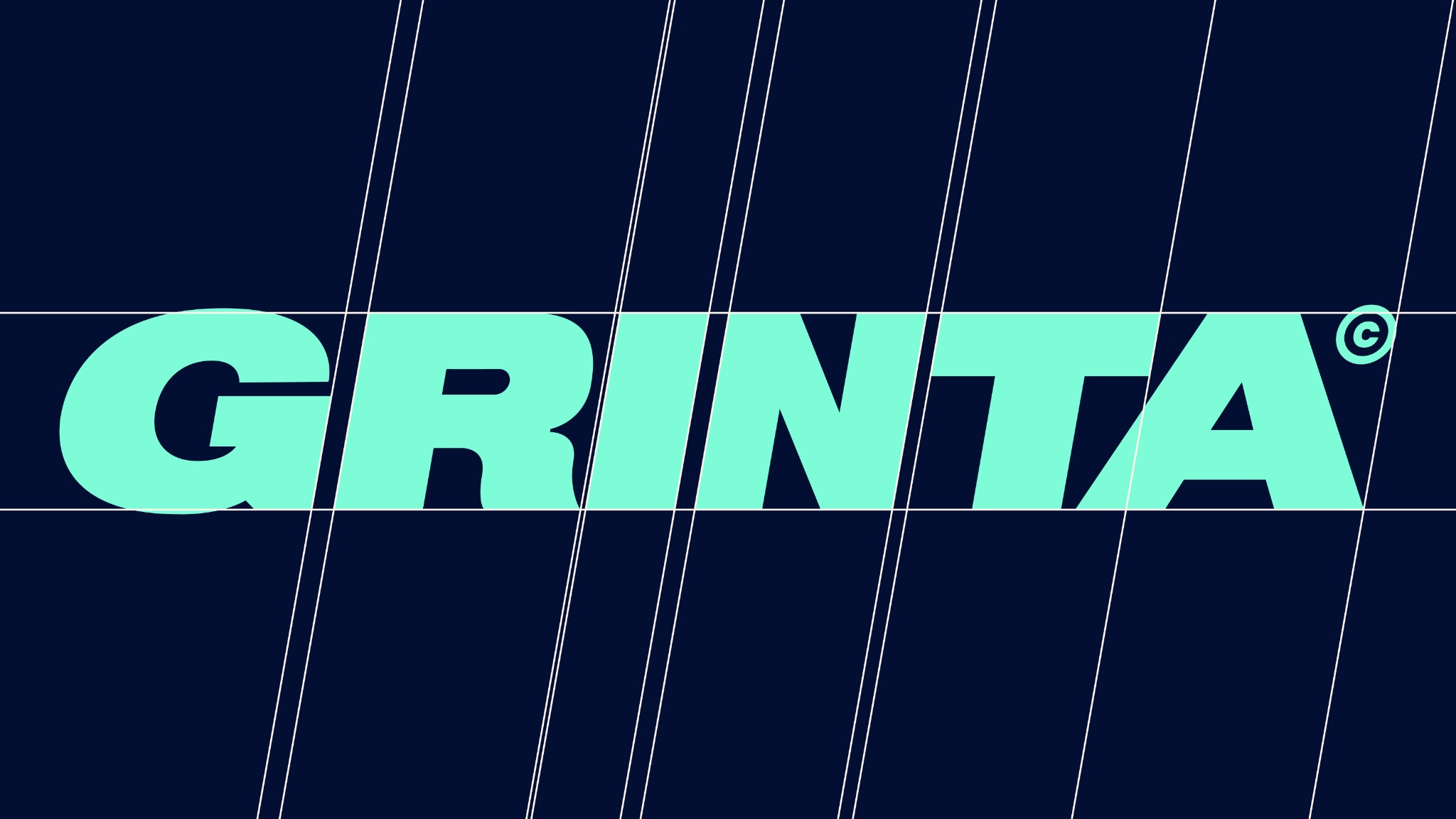
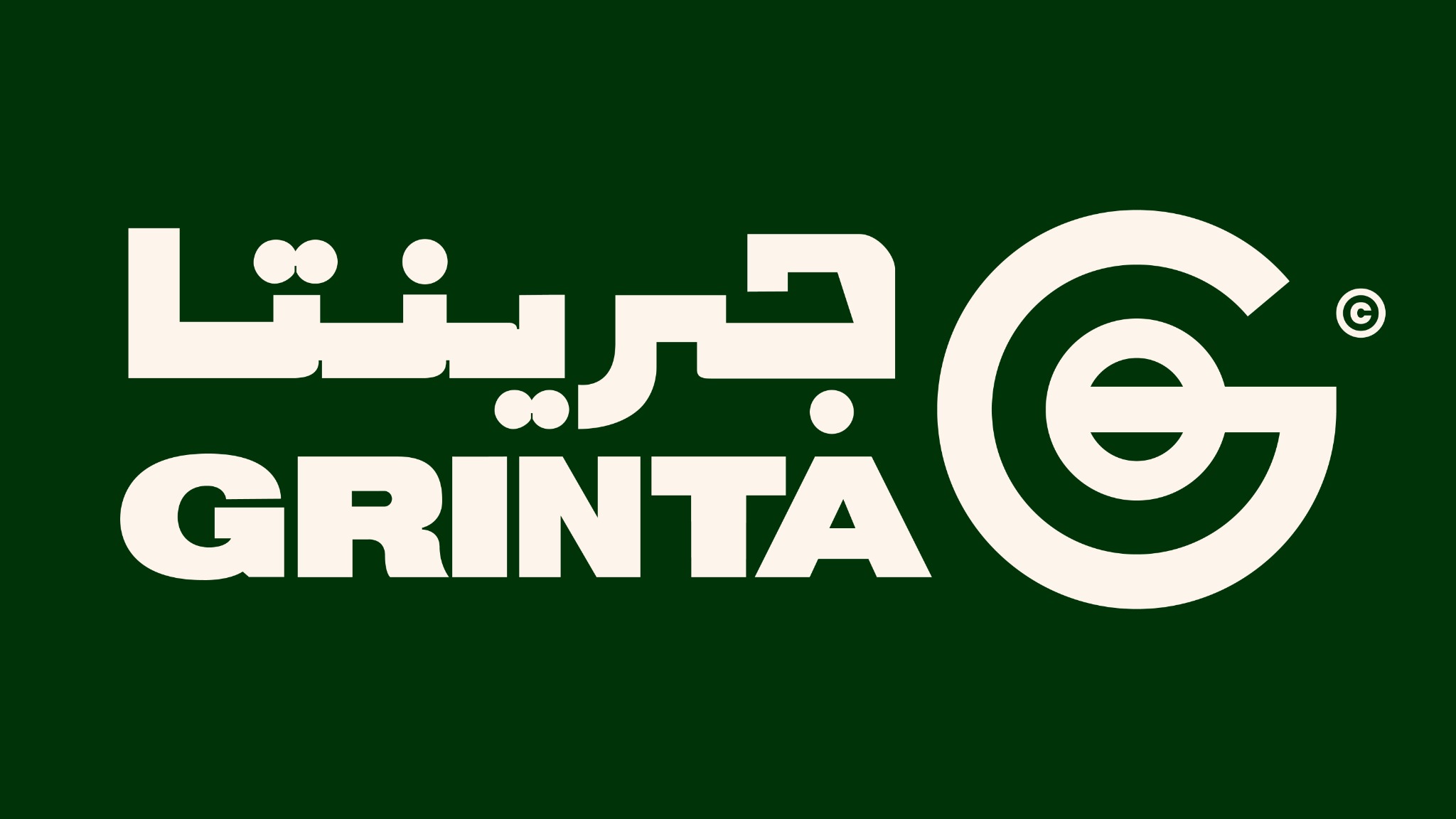
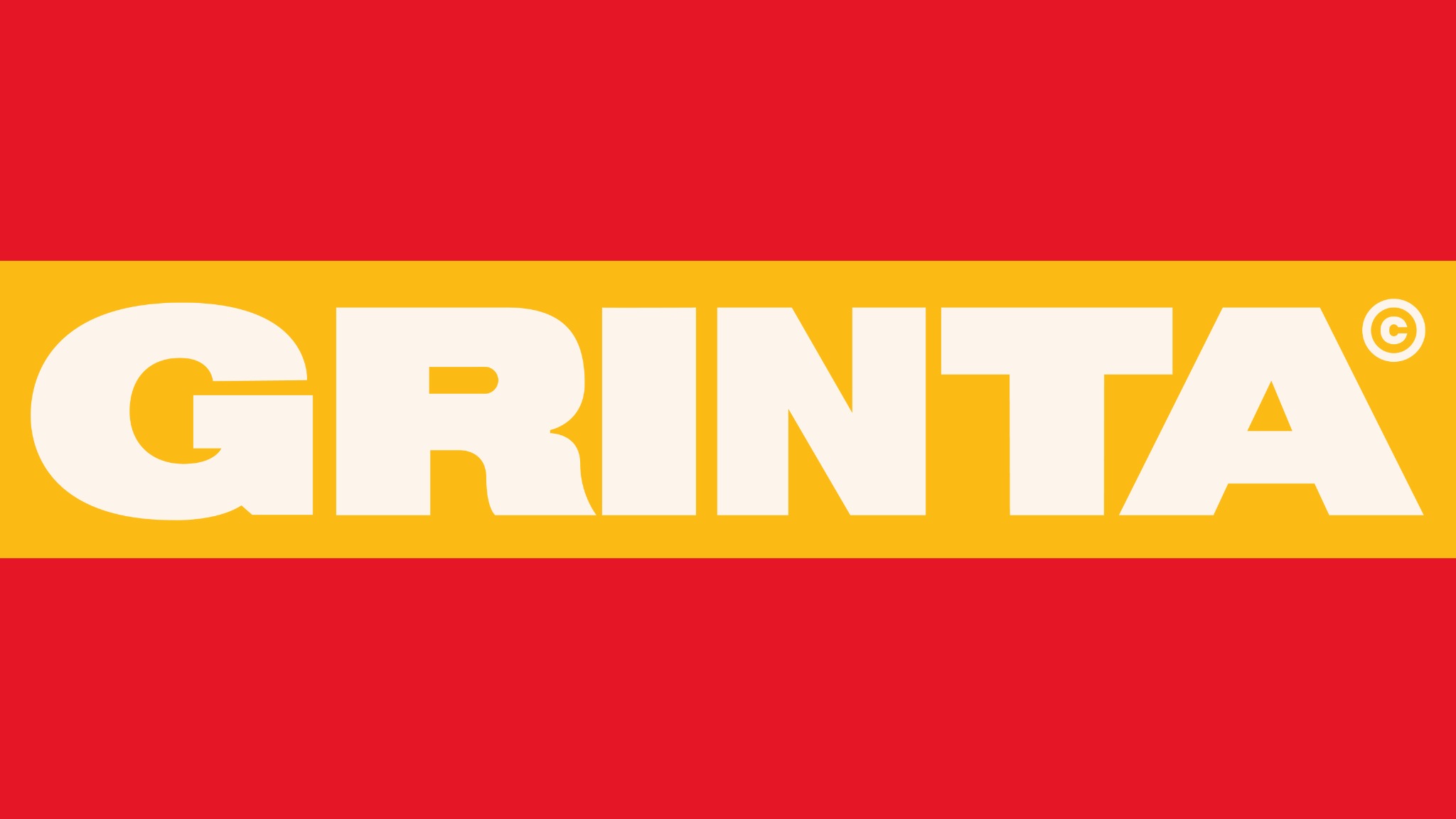
Color changes. The character doesn’t.
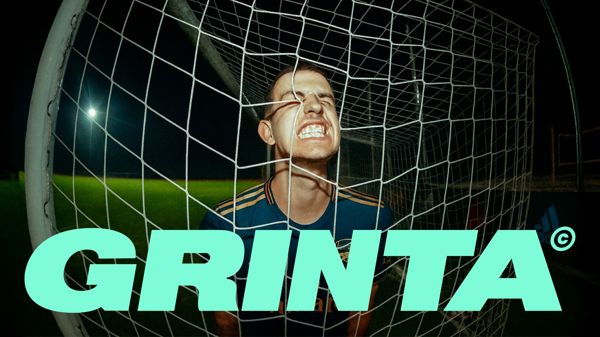
Flat, saturated color gives GRINTA room to move across campaigns — deep football green one moment, red or navy or mint the next. What holds it together isn’t one fixed palette; it’s the scale and weight of the typography staying constant underneath whatever color sits on top.
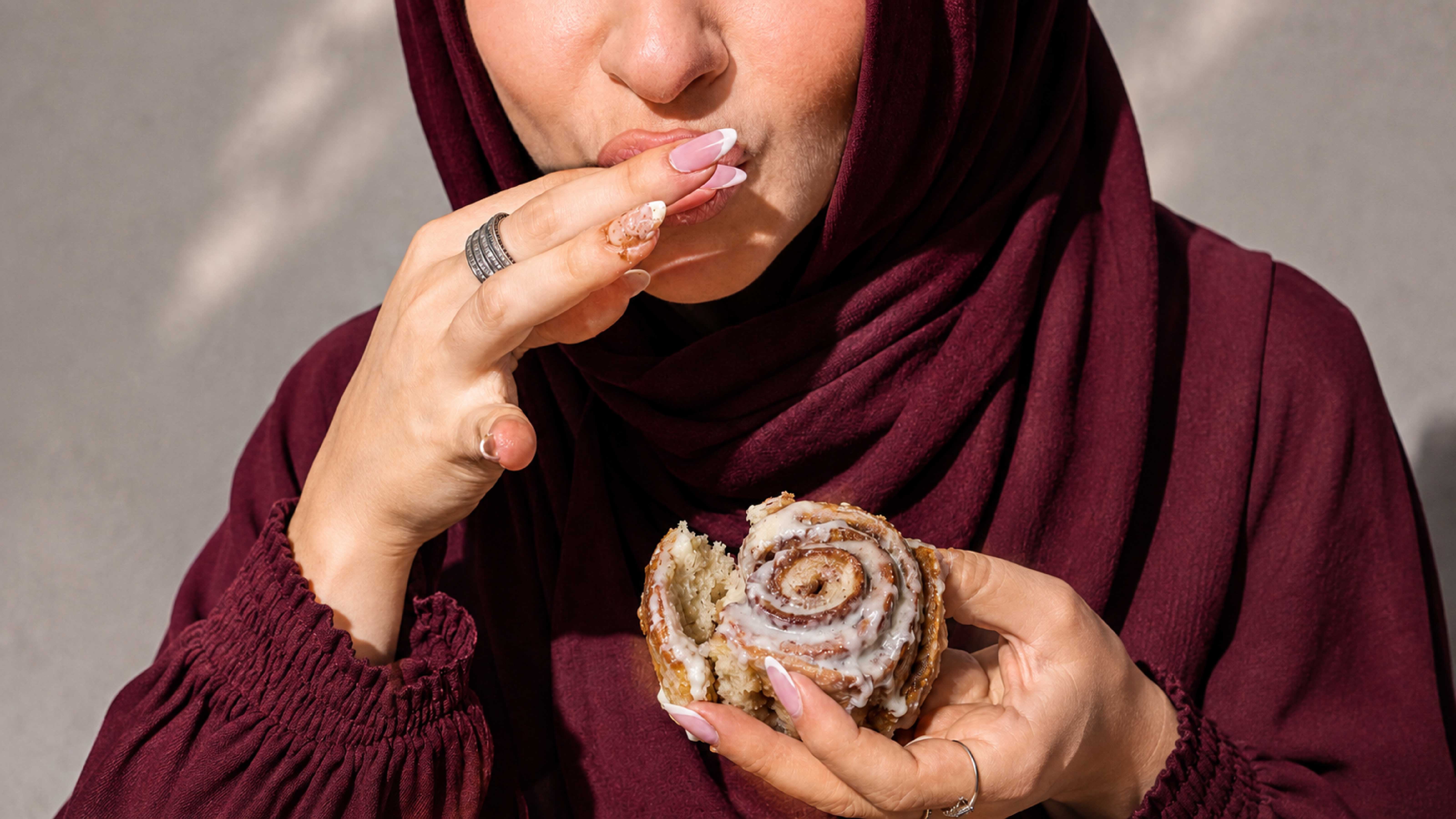
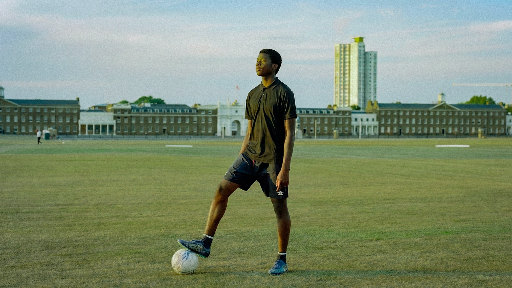
The photography skips the highlight reel.
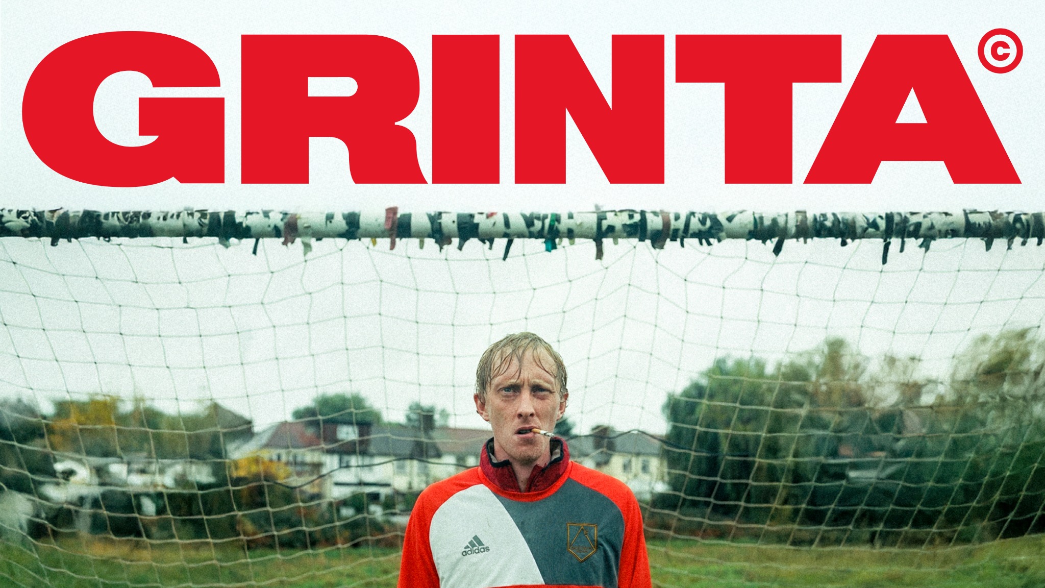
Grain, flash, awkward angles, empty goal nets, players caught before or after the actual moment — the imagery favors the in-between over the polished shot. It reads as more human than most football advertising, with room to feel competitive, funny, nostalgic, or serious depending on what the moment calls for.
Built to live on the pitch and on the screen.
The compact G handles the app-level signature; the full wordmarks take over for campaigns. That split lets the identity scale from a download prompt to a full-bleed photograph without running two separate design systems for product and marketing.

A football brand that’s also a working product.
GRINTA ties the app, the game, and the culture around it into one system. The core marks stay simple enough for a digital interface, while the typography, color, and photography carry enough personality to make the brand feel like more than an app icon.