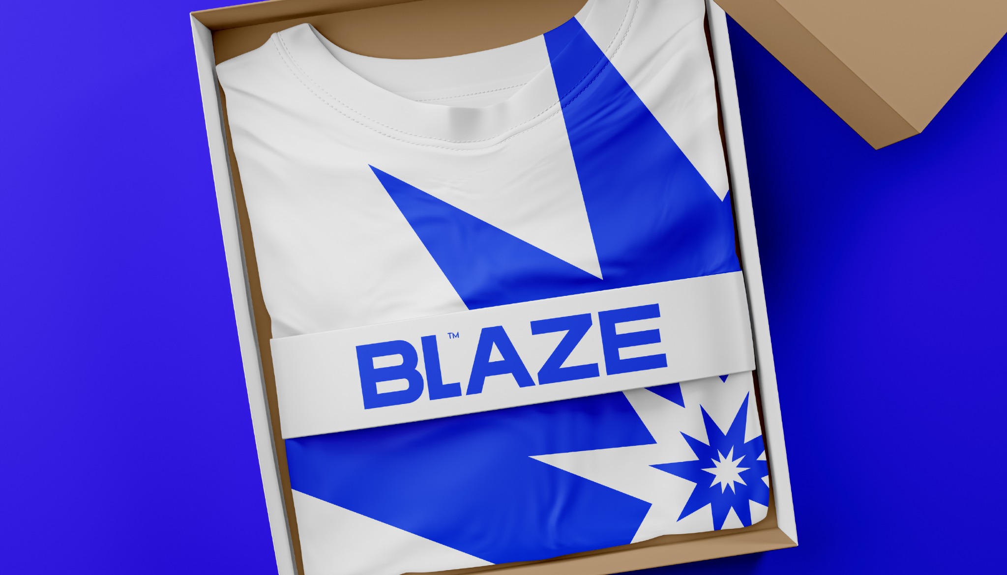
BLAZE is loud on purpose. The identity runs on energy and movement — a bold custom wordmark, a burst mark that reads like an explosion, saturated color, and street photography shot close enough to feel the heat. Nothing about it is meant to sit quietly on a shelf.

A few strong signals beat a big toolkit.
BLAZE doesn’t lean on an oversized system to get noticed. It runs on a distinctive silhouette, color turned all the way up, and a photographic attitude — three things that stay recognizable no matter how the composition changes around them.
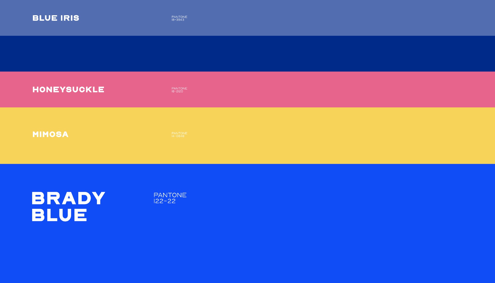
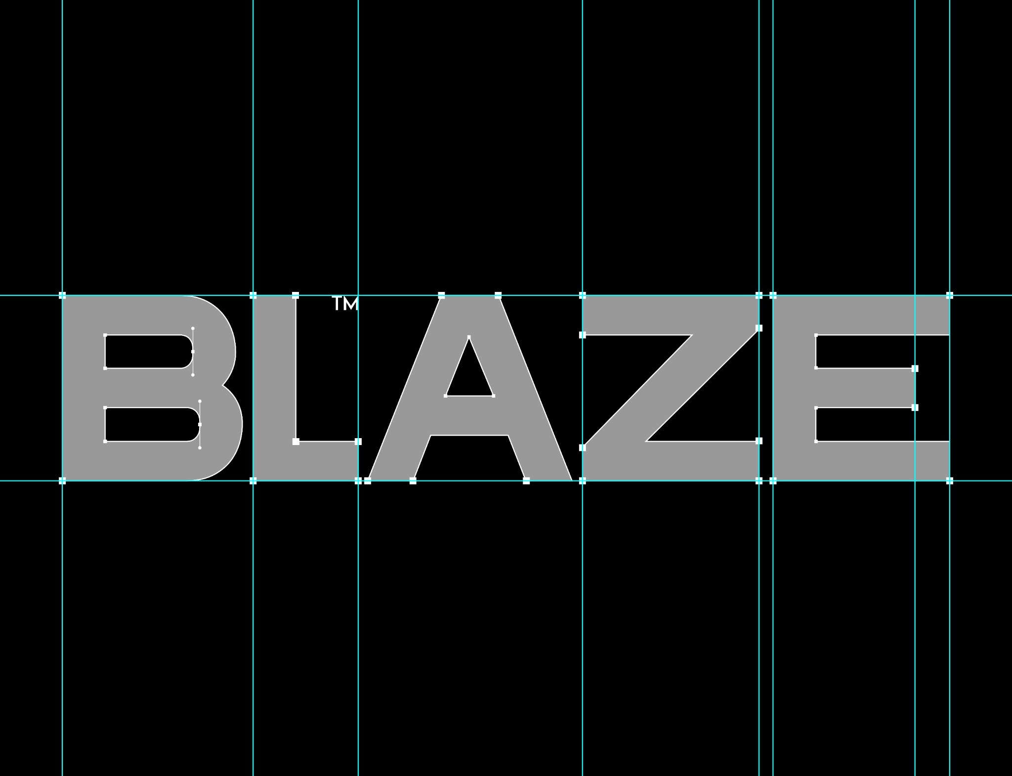
The wordmark carries the name. The burst carries everything else.
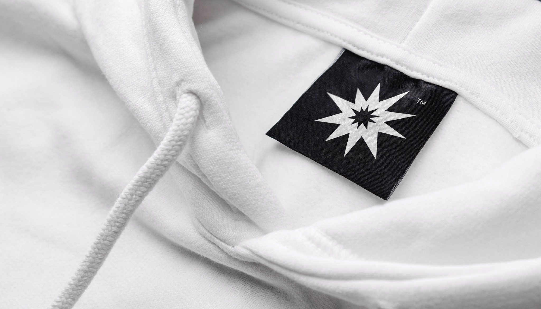
BLAZE’s wide wordmark does the talking when there’s room for it. When there isn’t, the burst takes over — a compact signature small enough for a garment label but sharp enough to still read as the brand. Between the two, the identity scales up or down without losing its edge.

The camera doesn’t keep its distance.
Wide angles, close crops, direct eye contact, hands reaching toward the lens — the photography puts the viewer inside the frame, not watching it from across the room. It feels less like a catalogue and more like the moment right before someone hands you the camera. That’s the same confidence the identity is built on.
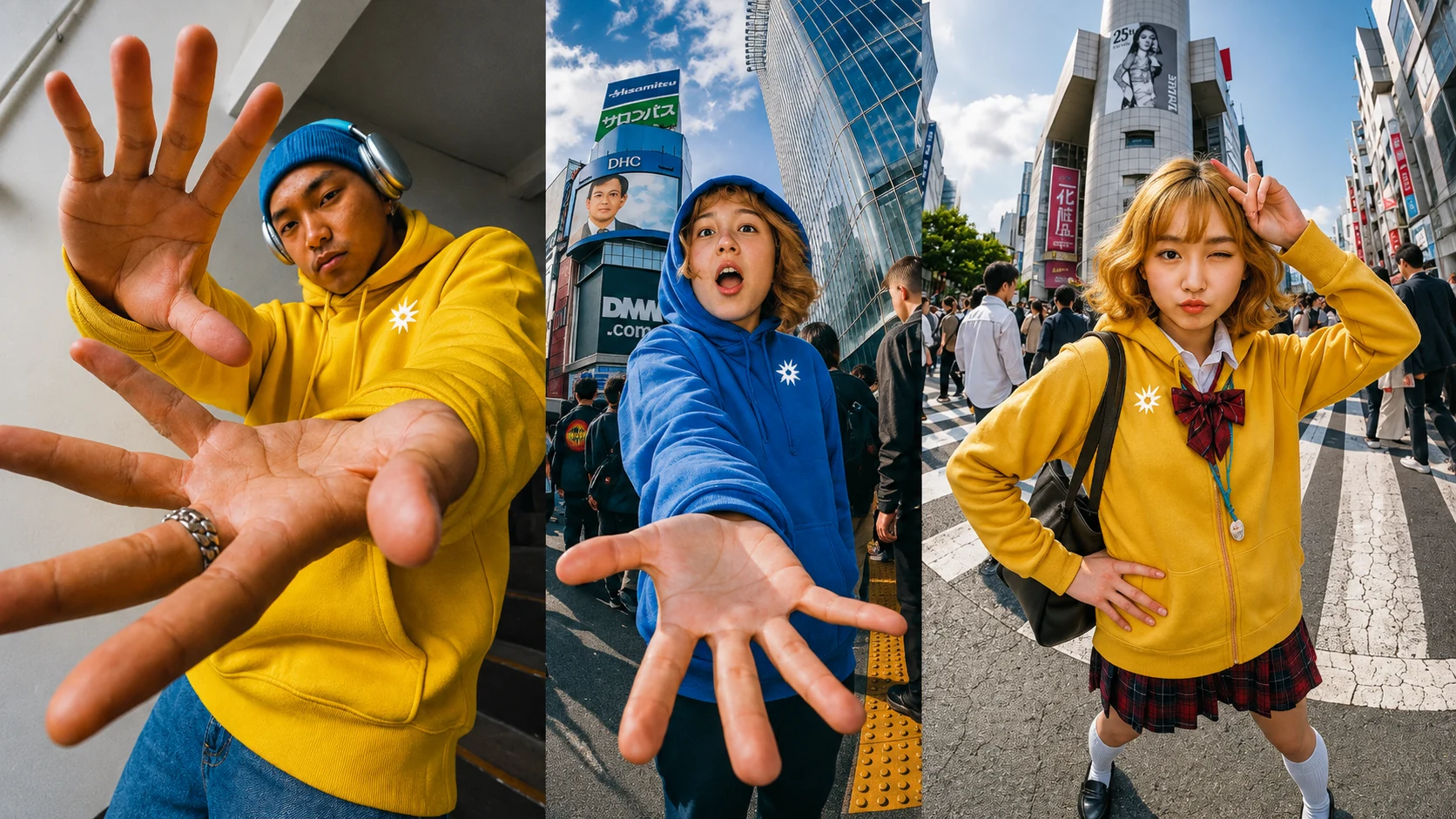
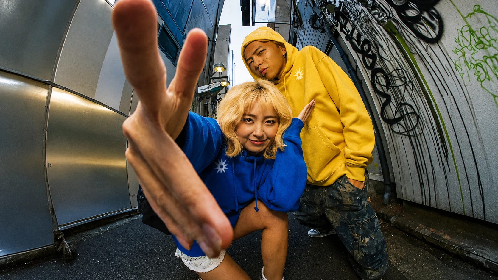

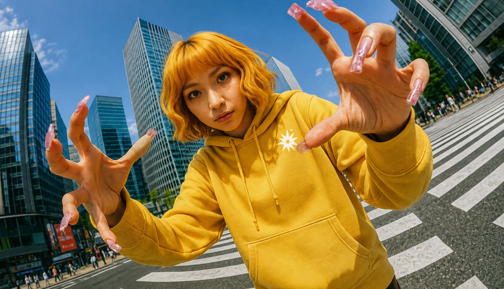

The brand is strongest on the product itself.
Campaign imagery is only half the system — the rest lives on the garment: hang tags, woven labels, packaging. The burst does the heavy lifting in small spaces, and the full wordmark takes over wherever the format gives it room to stretch.
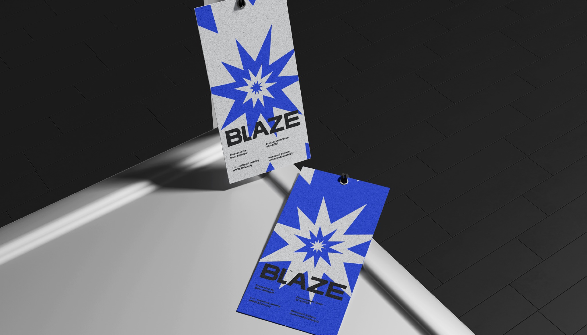
Small system, big enough energy to keep growing.
A direct name, a burst that’s hard to mistake for anyone else’s, color with no restraint, and photography with a clear point of view — that’s the whole toolkit. It’s tight enough to stay consistent and loose enough to keep the imagery evolving campaign after campaign.